


This is the Beam pitch deck to raise an $80m series-e round in 2021.
About
Beam Dental is a digital-first provider of dental benefits for businesses. The company’s product experience focuses on ease-of-use and tailored pricing that is fundamentally built on preventive care. Beam incorporates rewards for dental hygiene into policy pricing.
Founded in 2012, Beam Dental offers a digital platform to manage users’ insurance alongside a “smart” toothbrush with members who use the product often receiving better rates on their insurance.
The round was led by Mercato Partners’ growth equity fund, Traverse, with participation from new and existing investors, including Drive Capital, Georgian, Nationwide, and Breakout Capital. The round brings Colombus, Ohio-based Beam’s total funding to over $160 million.
“With this funding we can bring more brokers onto our platform, increase distribution and have faster onboarding,” Beam CEO and cofounder Alex Frommeyer told Insider in an interview. “We’re in 41 states at the moment and we want to add the remaining nine while introducing new products, including our next generation toothbrush.”
Beam has currently has around 250 employees but will likely to grow to beyond 300 with this fresh funding. Fundraising took around three months door to door and was fully remote. The round was also oversubscribed, Frommeyer said.
The company claims to have grown revenues substantially over the past three years. It doubled its member base in 2019 and again in 2020, according to Beam’s release.
“This round helps us build and scale our new products at a velocity that we wouldn’t have been able to achieve previously,” he added.
Funding rounds
| Announced Date | Transaction Name | Number of Investors | Money Raised | Lead Investors |
| Mar 2, 2021 | Series E – Beam Dental | 6 | $80M | Traverse Fund |
| Jan 5, 2021 | Venture Round – Beam Dental | 5 | — | — |
| May 29, 2019 | Series D – Beam Dental | 2 | $55M | Georgian |
| May 15, 2018 | Series C – Beam Dental | 1 | $22.5M | Kleiner Perkins |
| Oct 26, 2017 | Series B – Beam Dental | 2 | $5.5M | Lewis & Clark Ventures |
| Aug 8, 2014 | Series A – Beam Dental | 1 | $5M | Drive Capital |
| Oct 30, 2012 | Seed Round – Beam Dental | 1 | $430K | — |
Pitch deck review summary
Structured summary review
This is in many regards a fantastic pitch deck. They do a lot that you as a founder looking to learn about how to do pitch decks should learn from.
When you get to this level, you need someone external to give you feedback to question thinking in order to improve. The look of the slide might not appear fundamentally different, but you will see that the quality of the content and logic improves a lot.
Words
The wording is very solid. A few more words here and there could help with clarity, but there is only one slide where they go overboard.
Slide length
There are no page numbers in the deck which is peculiar.
The deck for series-e stage is definitely on the short end, but you never know if the decks shared publicly are the real, full ones.
Headers
The headers are way better than most decks. Maybe it is a personal opinion, but I really dislike their use of superlatives such as unique and only or buzz words such as AI. It’s like they know what investors like to hear and they have purposefully chosen words to tick VC alphabet soup.
I can turn on sales in person, but when I write a deck I like to be logical and let facts speak for themselves.
Appearance
There is nothing fancy in the deck that anyone quasi-proficient in PPT could do themselves (or steal elements). This is how I like to do decks. I also want decks editable so founders can adjust them on the way to meet someone.
Narrative
There is sort of a narrative but the deck is too short (as shared) to pick up if they really knew what they were doing.
Structure
It’s all solid. It’s a good example of how I like my decks. Anyone should be able to make a deck that looks like this in just a few hours.
Slides
They have not covered everything that an investor would like to see in a pitch by any stretch of the imagination, but I doubt this was their full deck.
Slide by slide review
Cover is fine. I don’t love they don’t have a .com.
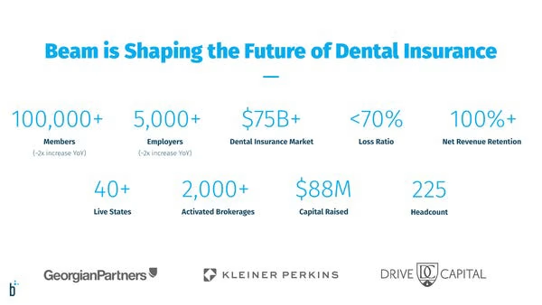
This is a summary slide. I almost never see founders do this well. This is probably the best example I can remember seeing publicly of late.
There is a little too much on the slide though. 8 points- 4 on each row would feel a little less overwhelming. All the points are pretty good though, so would be hard to say which to remove.
I’m personally not sold on sticking investors’ logos on slides, but then well, investors like seeing them, so. Eh.
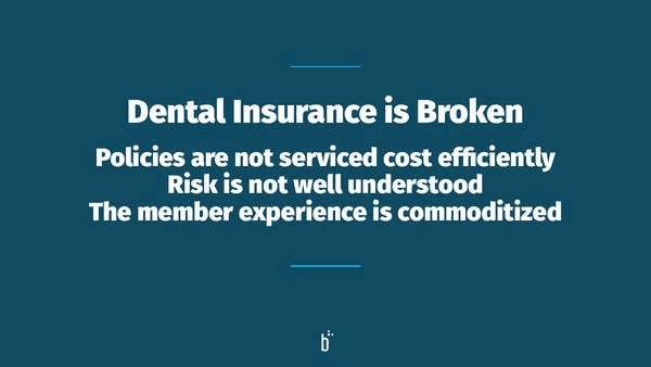
Hm, this isn’t a terrible slide. I would lead into these points and illustrate them with data to prove them.
Is the risk really not understood? Seeing things like this puts me on the bullshite defensive, where they need to change my mind.
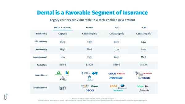
Their headers are fairly solid.
I just feel already they aren’t doing decks how I like to do them. The point is that dental is a place to be so this is a market size type slide. Row 5 is market size. They seem to be making a few points on the slide and they don’t lead with the point they are making.
I like structured tables like this with data points, there is just some logic in the slide missing.
I haven’t read the source text, but I love knowing that they have some. It’s a subconscious thing that the founders put in work and did research.
Gross, the text gets small and feels like a wall. Again, they do things well (sort of) in theory, they just aren’t quite doing it right.
If the text is good (I haven’t read it because there is too much), the rirst thing I would do is kill the image and better use the space.
This is sort of a hard slide for me to explain why it is wrong. I would just approach the slide in a different manner and likely put it in a different place.
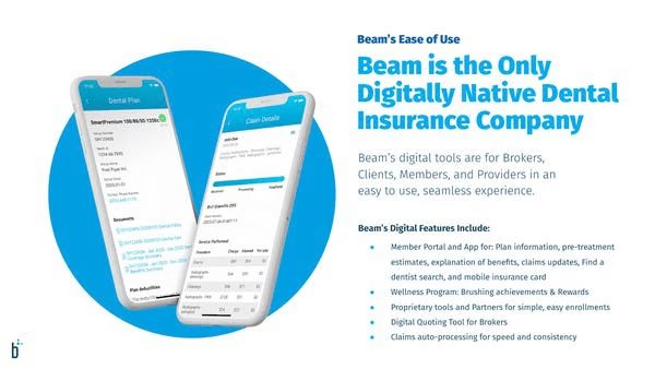
This slide is decent but just not great. There are some crappy forms and now there is something digital, but are people just populating data in a web form rather than with pen and paper?
You can look at this slide and wonder, is it really so bad? But if you internalise that each slide needs to effortlessly educate investors you can see it’s not quite doing the job optimally.
The way I approach things differently is to as “what is the point you want to make?” and then I design and structure the slide to answer it specifically. This slide doesn’t do this.
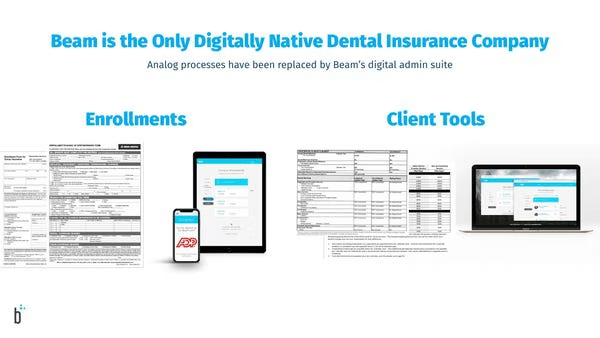
The titles are very solid, but the content doesn’t deliver as I would like. It is not quite explained properly.
There are the bones of a fab slide, but it’s not quite as intuitive as I would like.
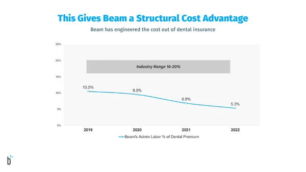
Don’t get me wrong, it’s a great-looking slide, it has data/chart, it’s structured well etc. All things I like. But if you want to perform at a high level in a deck, you have to sincerely consider the objective.
I can’t quickly tell you how to improve this slide (I’m busting out quick thoughts), I step back with the founders and discuss and we figure out how to do this better.
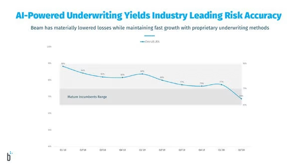
I hate anyone writing “AI” as it is almost always total bollox. Unless you explain how you do Tensor Flow etc, it’s BS.
I do really like this deck as they do so much better than 99% of decks, but even then you can always improve (and that’s why you have an expert give you feedback).
My main issue with this slide as I don’t understand how the chart ties to the header effortlessly. You need to make it such that Alexander commenting on your deck at 4am can easily tell you the point without thinking (which I am not doing presently).
The headers are decent, and the body of content is crap and lazy.
I would delete the image and probably have a 4 step process or something.

Again, this slide is ok, but what is it really saying? It looks like they want to add 6 more states?
You really need to step back and question if your slides are adding something. My feeling is maybe they have kept updating slides and they have become less useful over time.
It’s really hard to call BS on yourself when you have made a lot of decks. That’s why someone who has never seen your deck can ask dumb questions and say “what is the point of this slide?”.

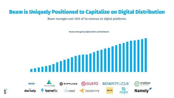
If you say you are uniquely positioned, then I want a competition slide for you to then prove it. I do not take your word for it. Soz buddy.
I keep saying this, but solid slide, just a bit confusing.
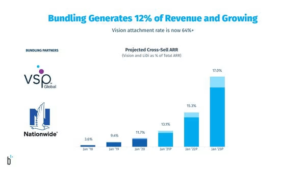
WTF. Rookie error. There are 3 color points on the slide. There is no legend so I don’t know what is what.
This is about cross-selling, well, is it the light blue part? I don’t know.
The logos on the slide for bundling partners aren’t really explained. What is attributed to what?
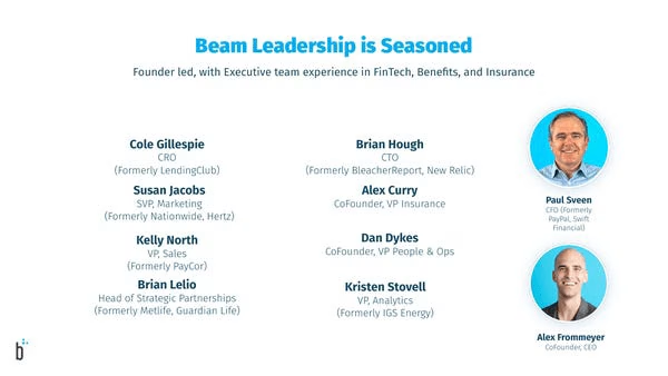
Um, sort of a decent team slide. I hate the fact the CEO is in the bottom right. It’s like Alex doesn’t want to make out he is important, but he is the star of the show as far as investors are concerned.
If you are doing a series-E 80m round, it’s perfectly fine to have up to 3 slides for the team. I mean, their team look super solid, so why not detail them?
Deck Collection
See the rest of the collection here:




Comments (0)
There are no comments yet :(