


This is the Alan pitch deck to raise a $54m series-c round in 2020. Deck is redacted as usual.
About
Alan is a digital health insurance platform that revolutionizes health insurance by focusing on user experience with an excellent price-quality ratio health plan.
Alan started by creating a health insurance company for individuals and companies, that they can trust as a service and enjoy as an experience. Alan is the insurance company that makes healthcare simpler, smarter, and better.
“We believe we have a significant role to play in society at Alan and that we should keep investing in that,” Alan CEO and cofounder Jean Charles Samuelian told Business Insider in an interview. “We agreed on terms before coronavirus became a big issue in Europe and wanted an ambitious round and we had no change in the negotiations.”
Health insurance is an obligation for French employers and Alan covers more than 76,000 members with a staff of 200. The company claims its revenues have increased 165% year-on-year to €58 million ($63 million) in 2019.
“This is a time for people to care about one and other and I think we see a long term trend of employers taking more care of their employees,” Samuelian added. “We want to be a major player in that.”
The company provides COVID-19 news on its platform, alongside a free symptom tracker. Samuelian said that the startup’s customer service teams are now pivoting to provide more services to users who are understandably scared and asking more questions.
Part of this year’s plan includes further expansion outside of France with Spain and Belgium next on the list, something Samuelian expects to see by the end of 2020. That expansion will see another sizeable cohort, around 80 people, join this year. The funding round was closed, remotely, around 10 days ago and was not materially impacted by the ongoing pandemic, Samuelian said. Index Ventures provided the most funding but Singaporean sovereign wealth fund Temasek co-led the round.
Funding rounds
| Announced Date | Transaction Name | Number of Investors | Money Raised | Lead Investors |
| Apr 19, 2021 | Series D – Alan | 7 | €185M | Coatue |
| Apr 20, 2020 | Series C – Alan | 2 | €50M | Temasek Holdings |
| Feb 18, 2019 | Series B – Alan | 2 | €40M | Index Ventures |
| Apr 10, 2018 | Series A – Alan | 5 | €23M | Index Ventures |
| Oct 25, 2016 | Seed Round – Alan | 4 | €12M | — |
| Mar 1, 2016 | Pre Seed Round – Alan | 2 | — | — |
Pitch deck review summary
Slide by Slide Review
Don’t include the date on the cover. It reminds investors how long you have been raising for.
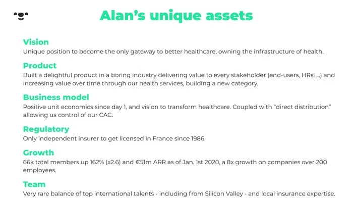
The title is a little bizarre. Their unique assets including having a vision?
The chaps are French, so perhaps there is some latitude for translation issues, but I doubt it.
Generally, try not to reuse words. They have unique in the header and also as the first word under vision.
Their vision sounds like some corporate wank. Don’t write things like ‘only gateway’. They’re in France which has public healthcare. Owning the infrastructure for health is a fairly lofty claim- are they going to own hospitals?
The things they write annoy me a bit. I like “Positive unit economics since day 1” as that is factual. Why do they need to add “vision to transform healthcare” again when they have a Vision section at the top?
I hate interstitial slides and they have loads of them. You only need them when you are making a 60 page document. Your pitch deck should be structured in a manner where you do not need them.

Ok, so quick observation- they do users headers properly (sort of) to tell the story in the deck.
How they structure the body of content is not that great though.
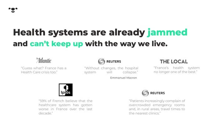
So that are saying healthcare systems are jammed (what does that even mean?) and then there are 5 quotes… I have to read all 5 to hopefully get the point they want to make.
Gross- do not center across selection in your deck. See the Reuters quote and how the second line is gapped to death.
I would only use quotes when you can’t possibly find another way to prove what you want to illustrate with a chart or other data-based derivation.
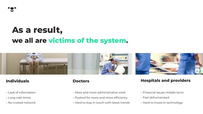
Why is the header broken up this way? “As a result” isn’t the point, it’s just an attempt to join the previous slide.
Do you see one data point on this slide? Nope. the structure is ok, but there are too many feelings and opinions. For example, for doctors, they could illustrate the number of doctors going to work in other countries?
Lol. What does this slide actually say? There are doctors, patients, and providers. No shite Sherlock… There is a diagram of sorts, so does that really make it all better? It’s a dumb slide which says nothing.
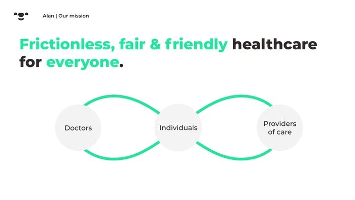
This reads like a vow at a wedding. Dull.

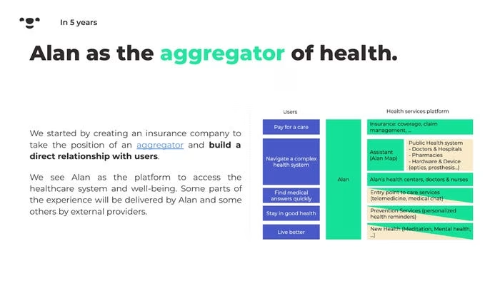
Ok, now we have a chart, but we also have a wall of text. Spacing on slides is important. If you want to have that table on the right, it should be the only thing in the body, other than a body header over it. You don’t have the space.
Read the text on the left quickly, does it say anything profound to you? It’s sort of a series of thoughts. What parts are delivered by Alan and the external providers? I imagine that is likely important?
As usual, I do not like interstitial slides.

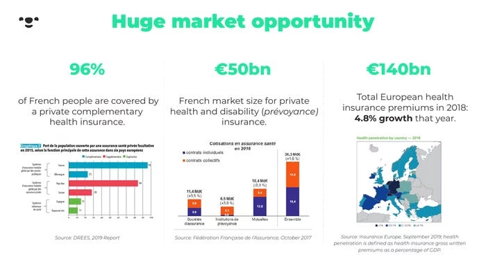
Yay! Data-gasm. The slide is structured well, but my gripe is that the charts are too hard to read. The slide images are not from the source so they are pixelated, but even if they were the source, I doubt I would be able to read the bar chart on the left without zooming in a lot. Another point is that I’m sure I would have to study each image to see the point. If you have all these variables on a chart you should add a circle to draw my attention so that I can see the point that you want to make rapidly.
I very much like 3 (Read: Rule of three). Ideally, you should add a header above each number to spell out what the point is. You always want to make it very easy for investors to get in and out of each slide and understand what the point is without having to study anything.
A small point to add is that you should add sources to slides. This gives investors the impression that the data actually came from somewhere. No one will actually check the sources, but it’s this sub-conscious thing (At least for former bankers and consultants).
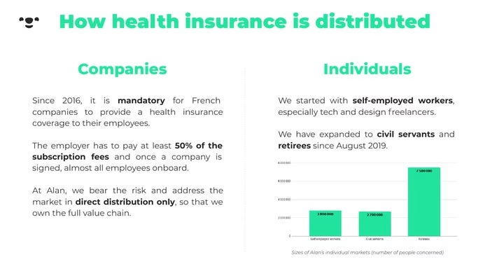
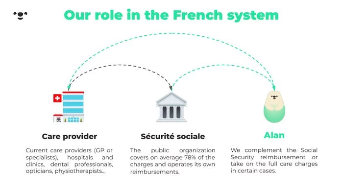
Never write walls of text. If you need to explain how insurance works in France then explain it in a flow chart. Also, you should cover all these basics in the industry section which is the start. You should be getting into details over time. So start micro and zoom in. Things get confusing when you zoom out and in.
My feeling with this slide is that the founders aren’t dumb, they understand the industry, they just haven’t quite decided what they need to explain, nor how to do it properly. Frankly, if I was targeting Le Americans who don’t understand French healthcare, I would write a separate document to explain it. Frankly, investors shouldn’t be investing in a space they don’t understand anyway.
What is their role? They don’t spell it out. You have to read to see.
A better header would be “We act as a middle man within the French system”. I made that up and it’s likely wrong, but at least it alludes to the actual point! I’m not sure what they are really doing in this section of slides.
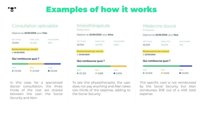
Decide who your audience is. Is it French or English speakers? If you want to do things in French, stick to French. If you want to do things in English then speak English. The three images look like screenshots. You can easily remake them and write in English. It’s similar advice that I give when using currencies – pick one and stick with it.
This isn’t a good slide as I don’t think you can send this to someone and they will understand it. You need to explain in person. In theory, it looks like a decent slide, but it’s probably better for presentation when getting into details in meeting 2 or three.
When things are complicated, my preference is to say “screw that” and make things simpler. My mentality is I can get into details when investors ask.
Guess what I am going to write?

I think we have established that this deck is for investors who don’t understand the French healthcare market. I would explain what the experience is for users first, then show how you make the experience a lot better.
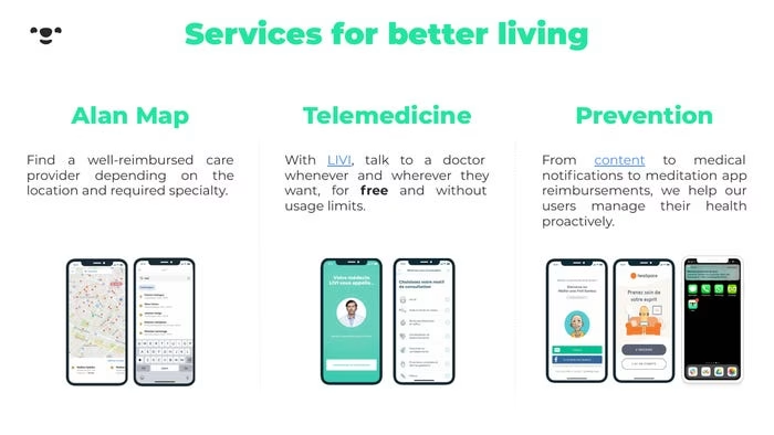
Just saying we are mobile-first and you can get questions answered doesn’t mean much in isolation. I want to know if anyone is mobile-first and frankly, how many people actually use their phone and not a computer to deal with healthcare?
I’m being critical, but presumably, these are the nit-picks you are hoping to learn from? Their slides are not terrible compared to the majority of decks, but things can be always be done better.
And honestly, it’s one thing to make a deck and it is entirely another to fly in, shite all over it and fly out. I personally need people to review what I do! It doesn’t matter how experienced you are and how much you know – everyone needs someone impartial and smart to review work. When you are stuck in something you lose perspective rapidly. That’s why I invented a methodology to make decks that explicitly work top-down.

What is LIVI? There is a link, but you shouldn’t have to send people off to a page to understand what is going on in your deck.
This seems like a product slide to explain how they work? If so, it could explain the process better.
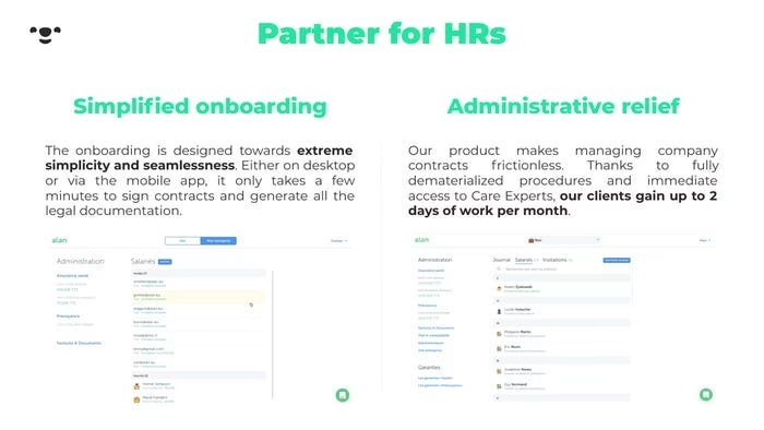
Who are the HRs? They’re jumping into something without bridging the gap. Is this a corporate play and Alan is supporting HR in companies? Well, you need to talk about the problem HR has first.
Before I make a deck, I map out the stakeholders in the business and decide who I am going to choose to address and whom I am not. For example, with Uber I would choose to focus on users and not drivers. I would only talk about drivers if I was later stage and raising money to scale up both sides. If you don’t decide what you are going to focus on upfront you will end up in a situation like this where you just start making slides without regard to your deck flowing and making sense to someone that doesn’t know your business (and what you know).
It’s really important to define your audience and write your deck for them.
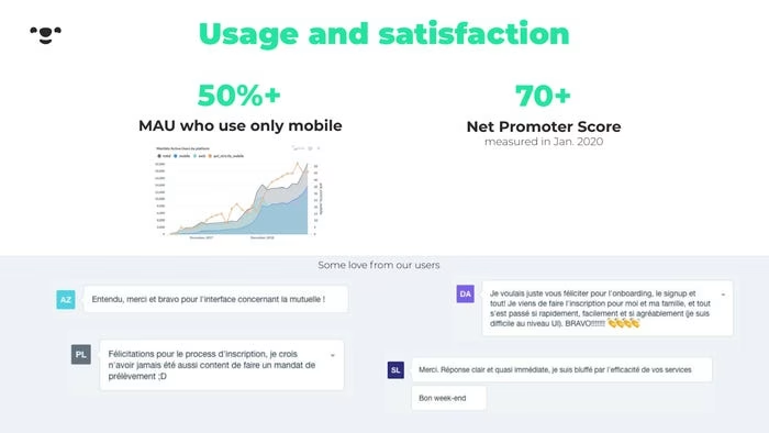
This has the grounding for a good traction slide, but eh. The chart on mobile is far too small. Also, they bang on about being mobile-first and only 50% of MAU use mobile. Is that really a selling point anymore?
Do they not have past data on how their NPS has progressed? Either they just started recording NPS, or their prior numbers are shite and they don’t want to include them. When you have seen enough decks, these are the thoughts you start having as an investor. I know the founders might be hiding something and you can pick up on them.
They take up 40% of the slide with some “love from our users”. Quotes are lame. Also to repeat, the text is in French. If your audience is English, then rewrite them in English. Ideally stick in some images of the people to humanise them. You can be sneaky and use random images too if you don’t know who the people are (no one will check).
Another interstitial… but hang on the last slide was a traction slide? Whatever.

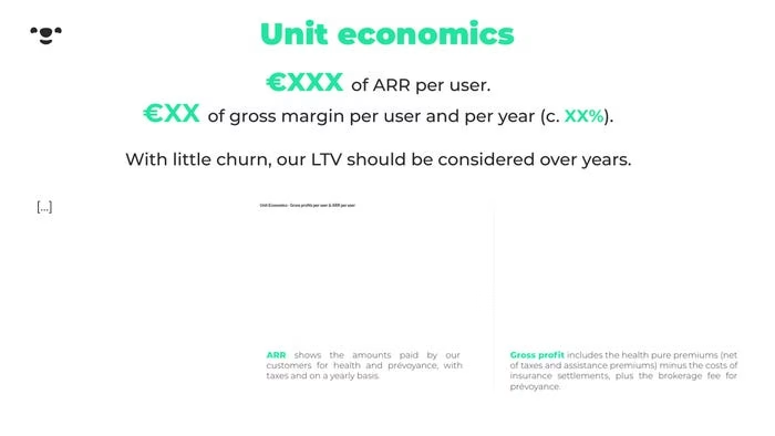
WTF? They have an interstitial for one unit economics slide? That’s just weird and lazy.
This is a series-c deck to raise 45m. It’s pretty weird that they don’t have charts. I know this is the document is public, but they made the effort to anonymize the financials with XXX so I’m more inclined to believe this is a slide they actually use.
I would want this slide to show the ARR evolution, with perhaps the margin on same graph. The next chart could show churn or LTV. The next slide would ideally have a cohort. But this is all a little confusing as they have another section next with growth?
When you do your deck, just have a section of slides for traction. Keep parts together. When you have a lot of traction you also want to take pain to tell a little story with the traction slides. If you can do this well, the whole execution should tell a story.
They have definitions at the bottom which I do like, but the definitions are a little ambiguous. Also, ARR is a SaaS term. Is Alan a SaaS company? I’m not sure.
When I see people include definitions of metrics I do think ‘these guys get it’. Investors love founders that are data-driven and understand metrics.
If you were to go all in on metrics and definitions, what I would do is have an appendix and define everything there. That is about the only time I would allow you to have an appendix section. OK, OK, I know some investors are OK with an appendix section, but I do not teach founders to do this because it’s a lazy way out. If founders were taught they could have an appendix section they would take an easy way out and stick random stuff in it rather than focusing on getting to the points they want to make in their deck.
In case you don’t know me and you’re reading this thinking what’s with all the judgment here!? I know how people make presentations. I’m very strict with teaching people because of the give an inch take a mile mentality people have.
Why isn’t traction in one section? It’s truly bizarre to have a one-page section for unit economics, then another for growth.

Good slide. Put considerable more effort into writing headers though. “Member growth has 2.6x in a year” is a far better title and it took me all of 2 seconds to come up with that.
I joke if I wrote a short book on pitch decks it would be entitled “write better headers”. They are so important to get your message across.
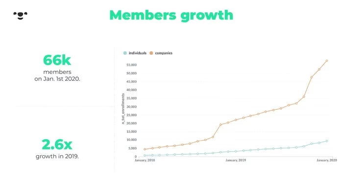
I just noticed that the horizontal axis labels are terrible! They are annual! I would use quarterly here. I would also format it as mmm YY so it would look like “Mar 20”- that way things would be legible. I might also optimize for text to be at an angle, but I am getting into details.
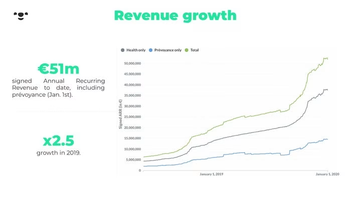
LOL. They write 51m in signed ARR here. Without considering details, if I divide that by the 66k users on the previous slide, would I get to the XXX of ARR per user they anonymized a few slides before?
Also, note that there are no page numbers so I can’t refer to slide numbers. Always add the page number in your slide master. There is always room if you follow best practices with negative space.
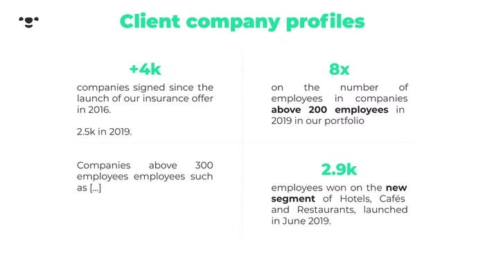
I don’t like how this slide is structured. And reading it the content is weird. What’s the point that they are making on hotels, cafes, and restaurants?
Look at Front Series-B, Slide 6 to see a way of making the point of covering different industries better. If that is the point they are making?
Stop!

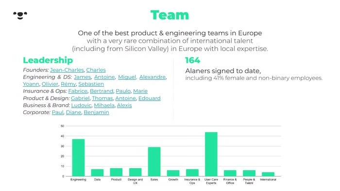
Use photos of the founders and focus on them. If you want to make a point about hiring people, make that a point. The team slide is about the founders and absolute key management.
Don’t get me started about non-binary stats on the team. Save that for Twitter.
For the stage they are at there should likely be two slides on the team. One is for the founders (that the investors are betting on) and the second to illustrate how they have successfully built an organisational hierarchy to scale.
When you just have alist of first names on a slide and links you’re saying “off you go, you decide what they point is after spending two hours looking on linkedin“. Ain’t nobody got time for that.
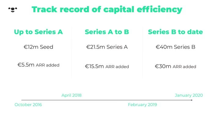
Investors love hearing the words capital efficient because no one likes dilution.
What’s going on with the timeline at the bottom of the slide? Bizare.
Hm, one observation is that the dollar per capital is decreasing. 2.3x to 1.3x. You can look at ARR to capital as a leverage ratio. AKA the bang per buck you as a founder are generating. I would ideally like that number to be increased under the assumption of how fixed and variable costs are allocated. I don’t know where the money is going to add much more commentary.
…

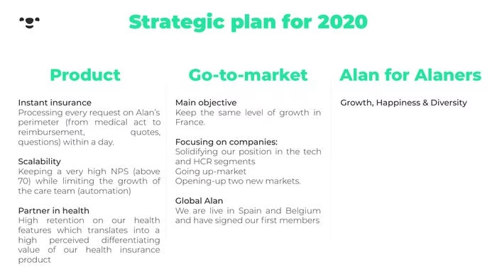
This could have been turned into a roadmap matrix.
To improve, why don’t you pick a few slides and critique how to improve them. You will learn a lot with regards to how to improve yours then.
Deck Collection
See the rest of the collection here:





Comments (0)
There are no comments yet :(