


This is the Awake pitch deck to raise a $36m series-c round in 2020.
About
Awake Security is a provider of an NTA solution that’s capable of detecting and visualizing behavioural, mal-intent and compliance incidents.
The Santa Clara, California, startup Awake Security raised $36 million in funding from Evolution Equity Partners in a round with participation from Energize Ventures and Liberty Global Ventures.
Awake Security provides security software that combines artificial intelligence with human expertise across machine learning and data science. Awake said it increased its annual recurring revenue by nearly 700% and doubled its employee headcount over the past year.
The Series C funding round also included its existing investors Bain Capital Ventures and Greylock Partners.
“Our round was oversubscribed, and this capital injection gives us the ability to move faster when this is done,” Awake Security CEO Rahul Kashyap told Business Insider, referring to the coronavirus pandemic.
This investment brings Awake’s total funding to nearly $80 million and will be used to continue to develop product research and expand the company into Europe.
“We have always focused on talent rather than location, so a number of our staff already work remotely worldwide,” Kashyap added. “But we will be making more hires in Europe as part of our expansion.”
The European Commission recently said cybercrime could increase given the likelihood that locked-down citizens will spend more time online. “This is a space facing very relevant challenges,” Kashyap said.
Funding Rounds
| Announced Date | Transaction Name | Number of Investors | Money Raised | Lead Investors |
| Apr 15, 2020 | Series C – Awake Security | 5 | $36M | Evolution Equity Partners |
| Jul 17, 2017 | Venture Round – Awake Security | 3 | $30M | Bain Capital Ventures, Greylock |
Pitch Deck Review Summary
Structured Summary Review
Words
They don’t have a problem with writing too much. There’s not enough per slide to explain things properly.
Slide length
There are 24 slides including what I think are appendix slides. This is fine, but they have a lot of pointless slides in my opinion.
Headers
These are not done well. Use your headers to tell a story.
Appearance
It is over-designed and masks poor-quality content.
Narrative
There isn’t a narrative and I don’t think the slides are even in the correct order.
Structure
The structure of the slides are ok. I like to be more fixed.
Slides
They aren’t covering everything that they need to. There isn’t a slide on how much they are raising, for example. I don’t see how large the market opportunity is for them, how they acquire customers etc. I would redo their deck pretty much from scratch.
Slide by Slide Review

The cover is fine.

The body text is too large.
This is not an opportunity, it’s a dream. Let’s see if there is a plan.
I know a bit about the security space as I have had a few clients and they aren’t off to a great start comparatively.
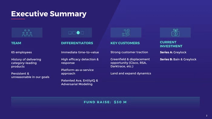
My general rule is don’t do an exec summary slide. They’re always done poorly and I’m not clear what the value and distinct purpose is. Decks shouldn’t be so long that you need an exec summary. I mean isn’t the exec summary sort of for execs that have no intention in reading a presentation?
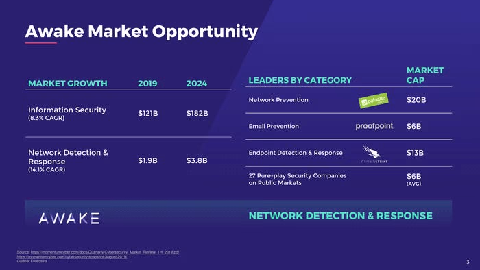
This is what a market sizing slide. This should around slide 13 depending on the length of the deck.
This isn’t a good slide. It looks like some work has been done, just not the right work.

There are 12 images and names and then a bunch of logos which I can only guess are places some of the staff worked at.
Lame. Investors only care about maybe 3 people. Focus on them and like add a few bullets to them.
I try to deal with topics at once. I would put traction together in the latter part of the deck. Otherwise, you are flipping between topics.
I can’t see the slide, but it sounds like it’s the client pipeline. I would have this around the go-to-market slide. This supports what your activities are. If you are doing enterprise sales it’s a bit hard to make an interesting slide, but your clients and pipeline are interesting. So in a way, you don’t need to do a GTM slide if you have a related traction slide. There is a bit of ‘it depends’ here though.
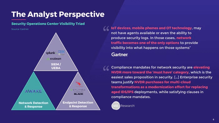
Ok, it’s cool to be mentioned by Gartner, but it’s not that interesting to just stick a slide in.
I find this slide a bit dull. They’re just like ‘Gartner mentioned us so go read some quotes and you can figure out why this is interesting’. I always want to tell investors reading a deck what the point is because they don’t really want to read more than they have to. Always do the thinking for investors.
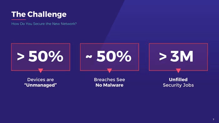
The titles of the slides aka headers suck. The challenge- why can’t you spell out the challenge for me?
Do you see what the challenge is? I don’t.
Also, don’t just stick in stats- you need a source for them to be credible (especially if you are using round numbers like 50%).
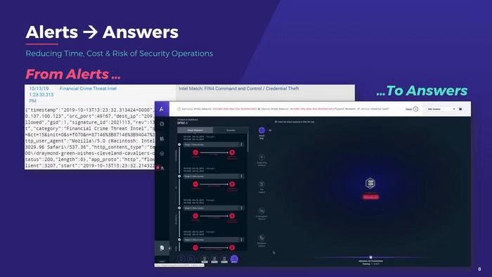
There’s no need to have the two images overlap. It’s better to just have the side-by-side and have the body headers on the same line.
I don’t understand how alerts turn into answers.
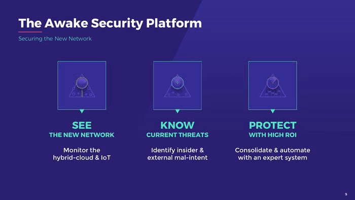
What is the New Network?
There is no contrast with the icons. You can barely see them.
The structure of the body content is fine, but do the points hit?
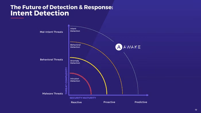
You have to decipher the graph to understand what the actual point is…
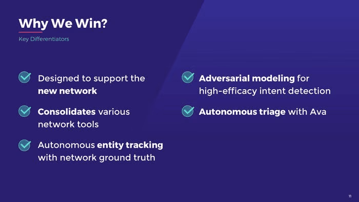
Typically there will be a key reason you will win. If you are at five points, well you can be certain they aren’t all key points.
These read like features more than benefits, or the outcomes their features provide.
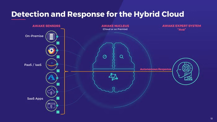
Here is an example of a designer making something look fancy, but there isn’t really any content.
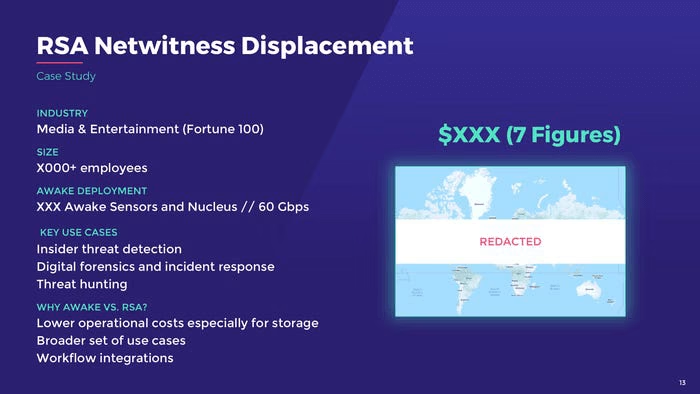
I rarely if ever have seen a good case study in a pitch deck. I like the idea of them a lot, but you need to dig deeper to illustrate value, such as showing quantifiable improvements for them to hit home.
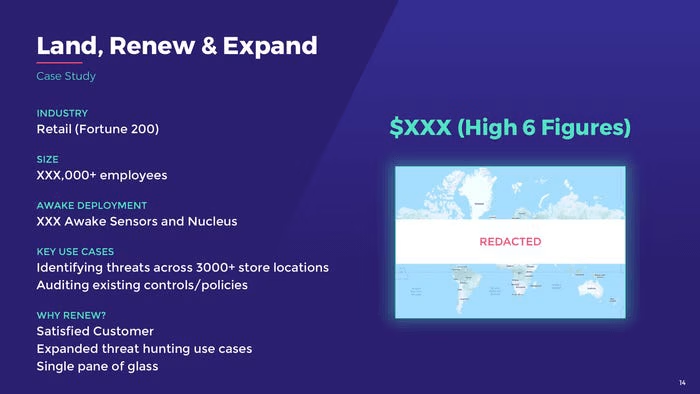
If the point here is land and expand then I want to see the dollar value of the expansion.
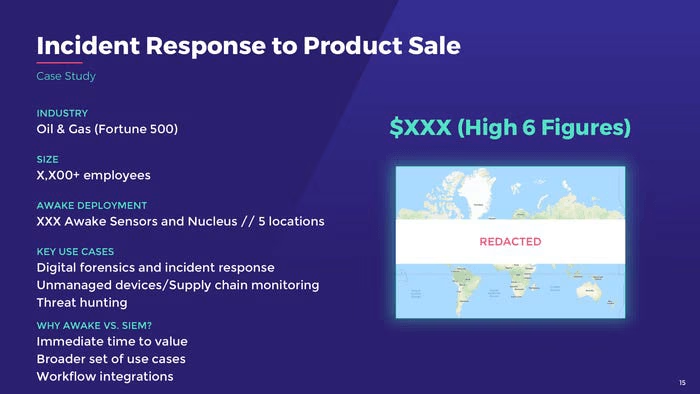
I don’t know what the point of this is. I wouldn’t have more than 2 case studies.
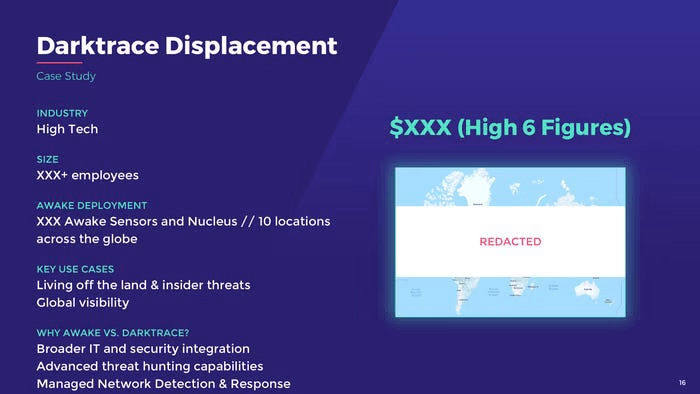
These should be at best appendix slides.
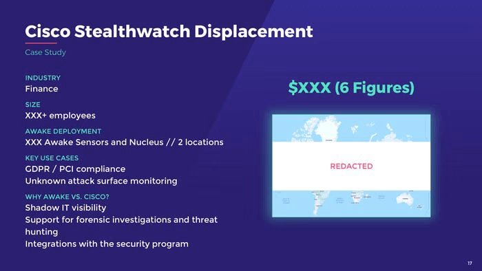
I’m starting to get the vibe they pulled these slides out of a sales deck. I don’t see how they support a pitch to you know, investors.
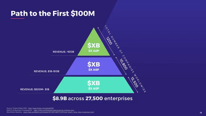
There could be something to this slide, but it doesn’t say much. They are what, going to expand to customer categories by size over time.
Only write text horizontally. Turning your head to read is annoying.

Metrics are always good to have.
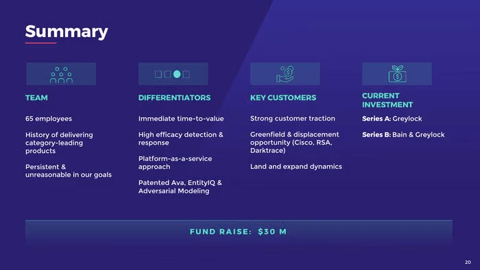
They have this slide at the top. There is no need to repeat slides in a deck.

I don’t like slides that don’t have a purpose.

I am guessing these are appendix slides?
I don’t get the point of this slide.
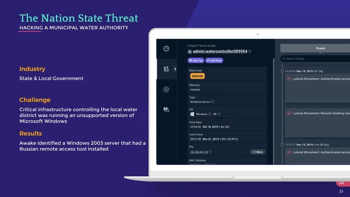
I don’t get the point of this slide.
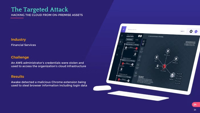
I don’t get the point of this slide.
Deck Collection
See the rest of the collection here:





Comments (0)
There are no comments yet :(