

This is the Claroty pitch deck to raise a $140m series-d round in 2021.
About
Claroty is an industrial cybersecurity company that helps customers reveal, protect, and manage their OT, IoT, and IIoT assets. The company’s platform connects seamlessly with customers’ existing infrastructure and programs while providing a full range of industrial cybersecurity controls for visibility, threat detection, risk, and vulnerability management, and secure remote access—all with a significantly reduced total cost of ownership.
The company is headquartered in New York City and has a presence in Europe, Asia-Pacific, and Latin America, and deployments on all seven continents.
Claroty’s new round is co-led by Bessemer Venture Partners’ Century II fund and 40 North. Additional strategic investors include LG, and I Squared Capital’s ISQ Global InfraTech Fund. All previous investors, including Team8 and long-time customers and partners Rockwell Automation, Siemens, and Schneider Electric, also participated. The round brings the company’s total funding to $235 million. The company did not comment on valuation, but PitchBook pegged it at $1 billion after the new round.
Claroty, an NYC startup founded in 2015, worked closely with Pfizer to secure its COVID-19 vaccine supply chain and counts General Motors, Rockwell Automation, and Siemens as customers.
This is the latest round in a segment of cybersecurity that is making headlines in both investing and national security news.
In February a hacker tried to poison the water supply of a Florida town, and many Americans realized for the first time just how vulnerable industrial sites are to cyberattack. Since then ransomware attacks have sparked a gas crisis and crashed the meat-supplier JBS for a month. In a summit with Russian President Vladimir Putin this month, cyberattacks on industrial sites were a major policy item for President Joe Biden.
The new focus on industrial cybersecurity has caused a market boom. Last year the Washington, DC, area startup Dragos raised a $110 million Series C venture funding round. And in February, Silicon Valley industrial security firm Armis raised a $125 million private equity round.
Yaniv Vardi, CEO of Claroty, said in a statement that “we have the financial runway to execute on our proven product strategy in a hyper-growth market.”
Funding Rounds
| Announced Date | Transaction Name | Number of Investors | Money Raised | Lead Investors |
| Jun 17, 2021 | Series D – Claroty | 8 | $140M |
40 North Ventures, Bessemer Venture Partners
|
| Dec 31, 2018 | Series C – Claroty | — | $8M | — |
| June 11, 2018 | Series B – Claroty | 11 | $60M | Temasek Holdings |
| Sep 13, 2016 | Series A – Claroty | 7 | $32M | Bessemer Venture Partners |
Pitch Deck Review Summary
Structured Summary Review
Words
Some slides don’t have enough words and a few too many. It’s a good deck though.
Slide length
I doubt this is their real and full deck. There is too much commercial stuff missing.
My bet is that it is longer than what they shared. If you are raising $140m you can have a long deck.
Headers
My bar is really high, but of public decks, they are up with the best I’ve ever seen.
The font size is too large and smaller would give them a bit of room for negative space.
Appearance
It’s really good. This is what you should aim for. There’s almost nothing to criticize. I was looking at some structures and thinking about how to copy them.
Narrative
It’s really good. I notice it breaks a bit, so it could be that this isn’t their full deck. Just read the headers and see if you can pick up a bit of a story.
Structure
There are some things I don’t like, but they are anal. It’s really good.
Slides
There’s a tonne missing, but I guess this is all they have chosen to share.
Slide by Slide Review

The cover is fine.

This looks like an interstitial slide. Don’t use them. Here they should start explaining what they do. This is what I call a one liner slide.

This is how I structure slides. What’s missing is a chart header to explain what I’m looking at so I don’t have to guess.
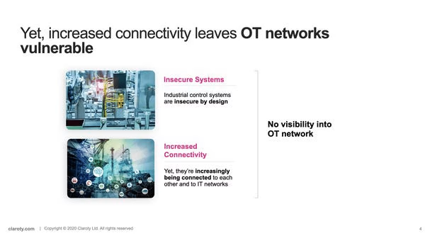
Keep your main header to one line without overflow. The header font size is too large.
I think the images don’t help other than give the founders a feeling the slide is pretty.
There are better ways to illustrate this slide, but it’s ok to do this if you are short of time.

So far I’m liking they have a strong narrative. You don’t see this often.
I don’t like writing things like ‘The Perfect Storm’ as it makes my eyes roll. It is too obvious they are selling.
I’ve done a security deck before and I showed the impact of breaches with fines banks etc got so there was a dollar value to the consequences.
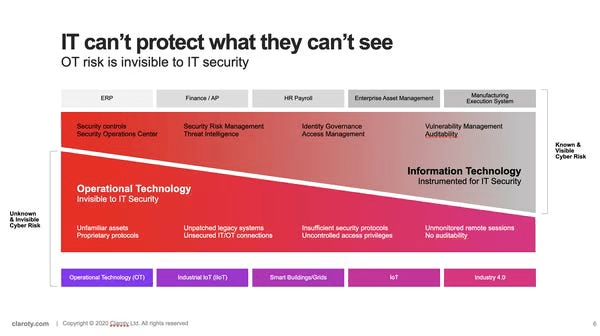
There’s too much going on with the slide. It takes too much time to understand. It’s a lot better than the crap in most decks, don’t get me wrong, but I’m nitpicking their deck as they do a very solid job.
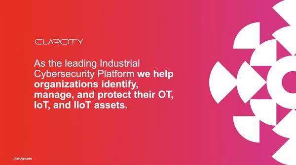
This is what they should start with which is their one-liner.
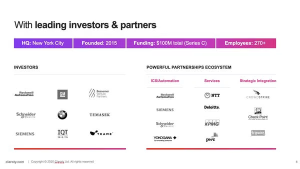
The header is weak. I’m personally not a fan of giving space to existing investors, but I can understand why founders do it.
With the partnerships, I would have a go-to-market to show what is in the pipeline, or the results that come from these ‘partnerships’ otherwise they are just fancy logos or people they met once in a bar. “How you doin'” 😉
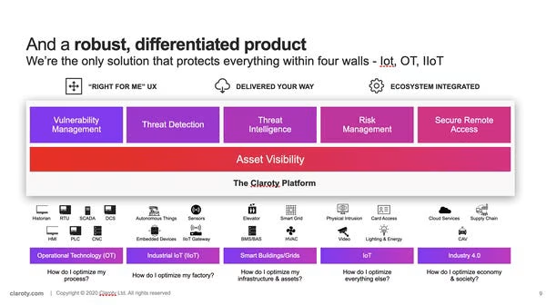
Are they really the ONLY solution? Be careful making these claims.
There is a lot on the slide, but this is a great example of a slide you can make when you have a crap tonne of people working for you. Small startups don’t have the resources to make these things.
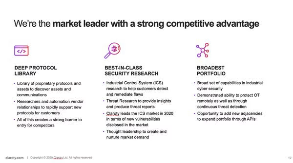
They need to take a knife to cut the points down to 3 points, and a scalpel to cut the words down more. It’s a bit too much text and gives people snow blindness.
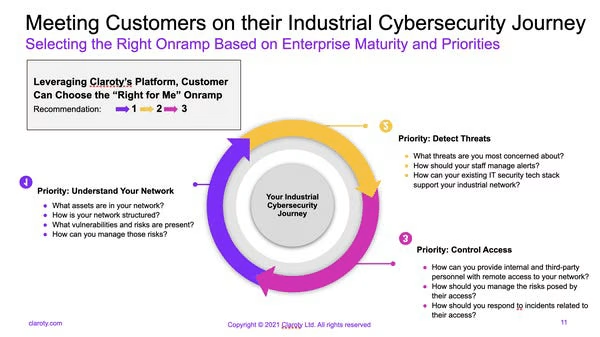
The content is getting a bit heavy. Only go here if you know your investors expect this kind of detail. They were raising $140m, so you can break a lot of rules I would tell early-stage founders as things are just different at this stage. Investors get far fewer decks so they will spend more time reading.
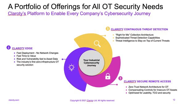
It’s generally a good slide. I just wonder if it could show their product too – I’m not sure.
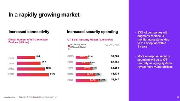
I deal with industry stuff at the start of the deck and only deal with something once. Don’t flit between topics.
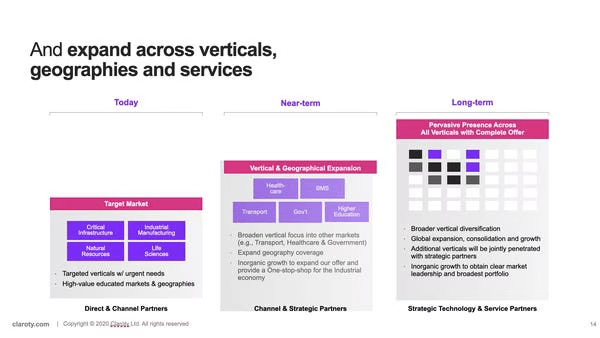
The formatting of the box is off on the second box.
Not sure what is going on with their connect 4 box in the third column.
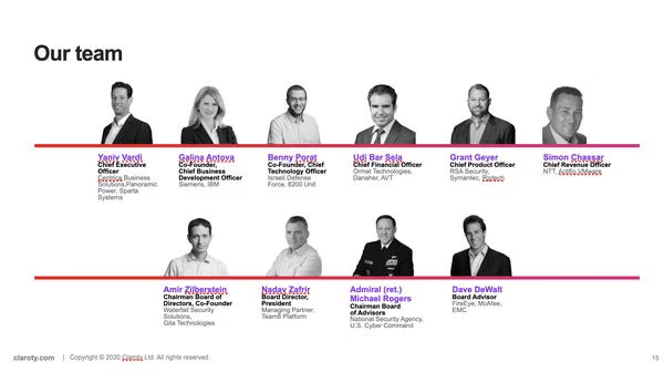
Don’t end with your team slide.
They should split this into two slides. Investors care about the team so it’s fine to have more than one slide if you have people worth showing.
Deck Collection
See the rest of the collection here:




Comments (0)
There are no comments yet :(