


This is the CodeSandbox pitch deck to raise a $12.7m series-a round in 2020.
About
CodeSandbox makes it easier to express and validate product teams’ ideations with code and aims to remove hassles when setting up a development environment, tooling, and sharing projects. Join us and help build the future of coding on the web.
Used by over 2M developers each month, including within organizations like Shopify, Atlassian, and Stripe, creators have crafted over 10M apps on the platform since launch. It’s used by thousands of open-source projects, including React, Vue, and Babel, among others.
The round was led by EQT Ventures, who originally discovered the startup through its Motherbrain AI platform, alongside existing investors Kleiner Perkins and Arches Capital. CodeSandbox helps teams to build and host web applications collaboratively, helping to solve a major issue for developers.
The company was founded in 2017 by former Facebook developer Ives van Hoorne and industrial designer Bas Buursma, to help speed up the process of developing websites and apps to ultimately free up time for developers.
“The most important part for us is making the process of building something more accessible,” van Hoorne, CodeSandbox CEO told Business Insider. “Our product frees up time for developers and makes development processes easier for other team members to collaborate.”
EQT Ventures got in touch with the startup in February, but the company wasn’t looking to raise. “We approached them to pitch a few months later and those talks came together during the summer to get the fundraiser done,” van Hoorne added.
The fresh capital will go towards launching the company’s next product, called Pro Workspaces, and expand the company’s headcount from 11 currently to around 40. Some 2.5 million people each month make use of the more than 10 million projects that have been created on the platform, van Hoorne said.
“Ives, Bas and the CodeSandbox team are product-centric, full of energy and — frankly — born and raised online, so the ideal team to take on one of the final frontiers when it comes to shifting to the cloud,” said Ashley Lundstrӧm, deal partner and investment adviser at EQT Ventures, said.
Funding Rounds
| Announced Date | Transaction Name | Number of Investors | Money Raised | Lead Investors |
| Oct 29, 2020 | Series A – CodeSandbox | 3 | $12.7M | EQT Ventures |
| May 7, 2019 | Seed Round – CodeSandbox | 7 | $2.4M | Kleiner Perkins |
Pitch Deck Review Summary
Structured Summary Review
Words
They switch between walls of text and not enough text to explain what the point of the slide is.
Slide length
This isn’t likely to be the actual deck they used and it was likely edited to be a marketing piece to share.
The deck is on the short end for their size of raise.
Headers
Terrible headers. Do not write a header like it’s a placeholder text to remind you what the slide is about. Write what the bloody problem is etc so investors don’t have to figure it out.
Appearance
This is illustrative of the danger of using a graphic designer. They make something pretty but isn’t useful to read. Focus on contrast and readability.
Narrative
There is none and I don’t think the slides are even in the correct order.
Structure
Everything is generally well aligned and there is negative space, only there is too often too much blank space and not enough content.
Slides
I don’t know how much they are raising to achieve milestones. I don’t know what their plans are. I don’t even know how they make money.
Slide by Slide Review
The cover is fine.
Never write a block of text and leave things like that. It’s terribly boring to look at.
The first paragraph says very little and sounds like a love letter to Gilfoyle from Dinesh (I’m in love with her code).
The header of the slide should just be “Dev environments are more complex and teams and distributed” then the slide should explain how specifically.
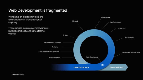
Is there no stats on the average number of tools that devs use these days? I’ve certainly seen some before. Back up what you say with data points so what you say will be accepted.
What is the proof that these tools provide ‘incremental value’?
I would add some logos to the bullets to illustrate examples.
The header could be “Devs work in teams and not alone, but tools don’t focus on collaboration” then you could show one example of this to illustrate it to investors.
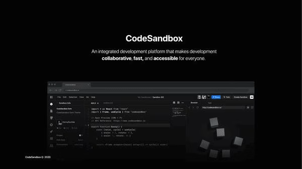
The slide is a bit better, but why can’t they point to the features of their product to explain it?
This is a lame slide, right? What tool do you think they are building? I don’t know. It assumes a lot of prior knowledge.
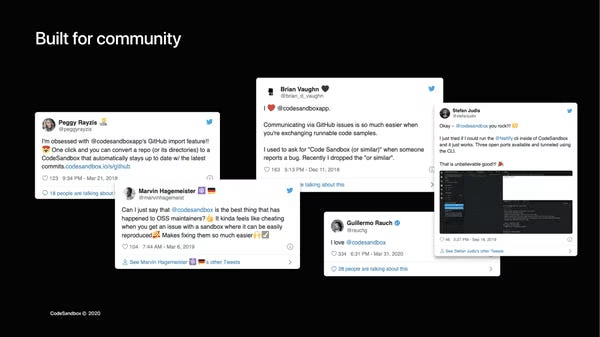
This is a lame traction slide.
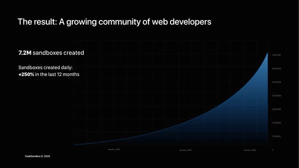
The line is too smooth I’m guessing it is quarterly numbers or something. They used a designer who likes dark grey on a black background so there is no contrast on the axis labels. You need to design to make your slides easy to read!

This adds no value. What leads are coming from these sources? There needs to be a ‘so what’ answered on every slide you make!
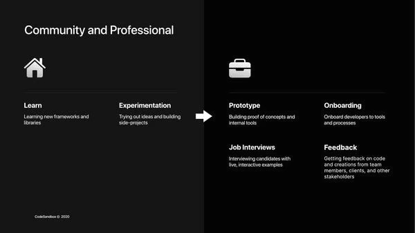
Do not write a header with three words. Explain every slide so investors don’t have to think.
I can’t look at this slide quickly and tell you what the point of it is.
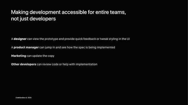
Sounds like Figma?

I doubt this is real data. They pr0b inserted blah just to share it publicly.
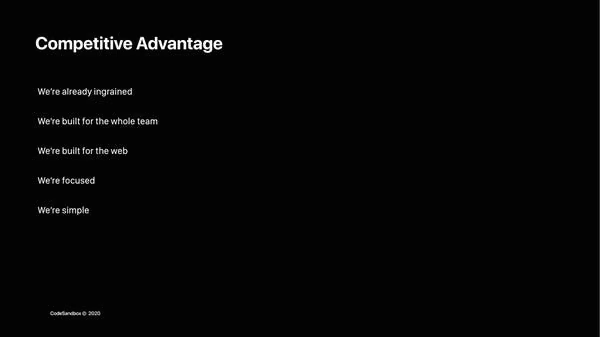
These are not competitive advantages. Are they asserting all of their competitors are not built for the web?
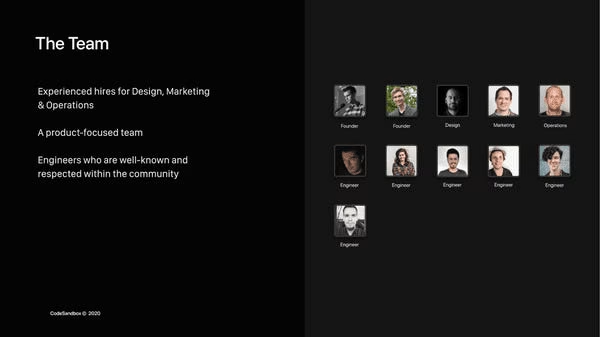
The point of the team slide is to show you are the best team for the job. I just see inconsistent images.
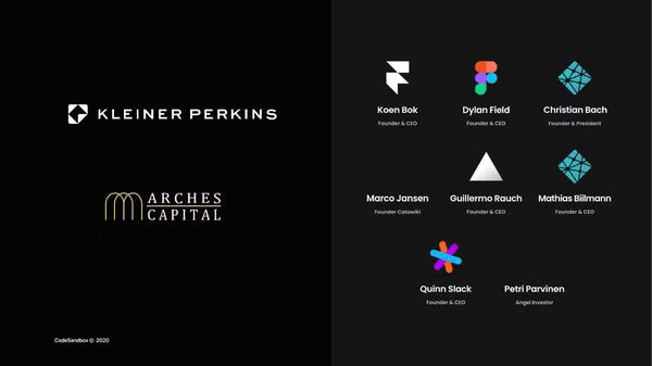
I have to guess these are their investors. Social proof matters, but it doesn’t warrant a whole slide.
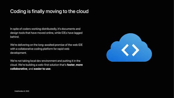
Don’t write blocks of text ever. No one wants to read it. I feel they are repeating themselves a bit and explaining what they do at the end of their deck, which is bizarre.
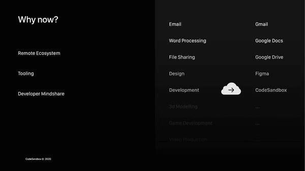
What’s the point? This trend has been going on for a decade so I don’t see why late to the party is the right time.
Deck Collection
See the rest of the collection here:




Comments (0)
There are no comments yet :(