

This is the CodeSignal pitch deck to raise a $25m series-b round in 2020.
About
CodeSignal develops an objective automated skills-based assessment platform that can be used as a standard for technical recruiting.
The firm is working to disrupt the recruitment industry, which is thought to be worth close to $200 billion in the US alone, according to experts. Leading tech firms such as Zoom, Instacart, and Robinhood count themselves among CodeSignal’s clientele.
“The pandemic has further accelerated the digital transformation that has been happening over the past few decades leading to a sharp increase in demand for developer talent,” said Tigran Sloyan, CEO of CodeSignal, adding that standard methods of recruitment were “failing everyone”.
“Highly qualified candidates are suffering because they get locked behind their resumes, recruiters are suffering because they spend time with unqualified candidates, and engineering managers feel the burden of spending countless hours on interviews that lead nowhere,” he added.
As well as Menlo, the firm also received funding from Capital One Ventures, CM Ventures, Human Capital, TripHammer Ventures (Alumni Ventures Group) as well as existing investors such as e.ventures, A Capital, Felicis Ventures and Correlation Ventures.
Funding rounds
| Announced Date | Transaction Name | Number of Investors | Money Raised | Lead Investors |
| Dec 8, 2020 | Series B – CodeSignal | 9 | $25M | Menlo Ventures |
| Nov 18, 2016 | Series A – CodeSignal | — | — | — |
| Nov 17, 2016 | Series A – CodeSignal | 7 | $10M | Headline |
| Apr 2, 2015 | Seed Round – CodeSignal | 18 | $2.5M | — |
| Feb 27, 2015 | Seed Round – CodeSignal | 1 | — | — |
Pitch deck review summary
Structured summary review
Words
There are a few too few words on each slide. You need to write enough so your deck can ‘stand in the wild’. Don’t write a deck just to present in person as that’s rarely how a VC pitch goes.
Slide length
I doubt that this is their full deck. It’s too short for a series-B round.
Headers
They do a little bit better than most, but they don’t write headers properly. Write full sentences that explain the point.
Appearance
It’s not amazing, but you do not need to hire an expensive designer! Sure, it can be better, but it’s fine!
Narrative
They attempted to make one and there is a bit. It’s just not super compelling.
Structure
There are a lot of basic things that they do not do well. Charts are the big one. You need headers, clear axis labels etc.
Slides
Everything commercial including how much they are raising is missing. I presume this is not their full deck, just a part of it.
Slide by slide review
Cover is fine.
Don’t add an agenda slide.
Do not use interstitial slides. You absolutely shouldn’t have to.

Bad use of space. The content is ok but can be explained better.
You should explain each slide so investors don’t have to think.
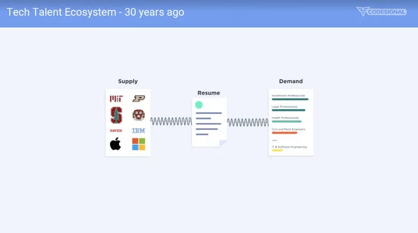
This probably makes sense to someone who knows the space, but it’s not obvious enough.
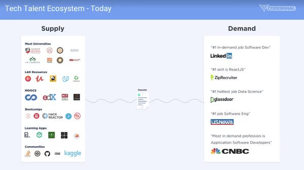
Do not write “the cost of resumes”. Explain the cost of the impact of resumes on your target audience to explain the pain.
The point is probably that the top of funnel is highly ineffective.
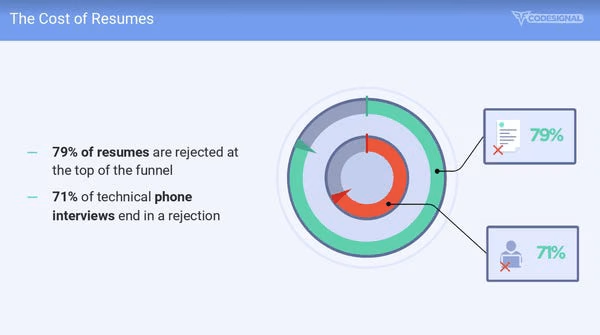
I have no idea what this means. They have not explained it like you assume you’re going to explain it in a room.
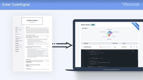
No interstitial slides.
Not clear. They do seem to be able to get to the points they want to make, they do not explain what I’m looking at.
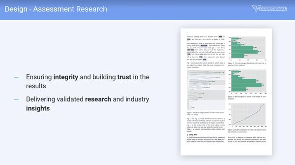
Ok sounds great, but I don’t understand what they are doing here. Is this about doing dev tests?
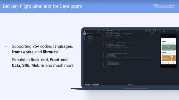
People are ranked across scores?
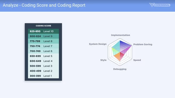
Don’t do these slides.

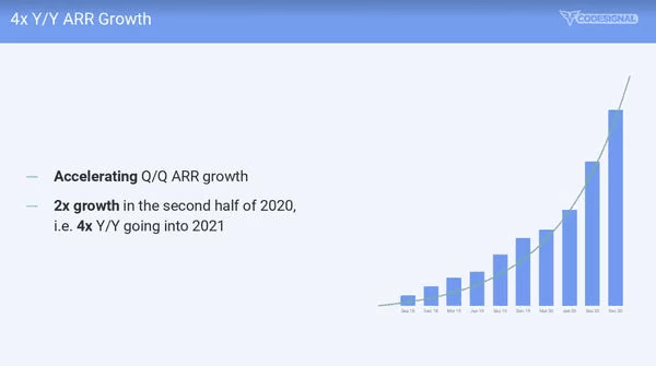
The clearly added the green line to make it look more up and to the right. I wonder why things just spiked as they are raising.
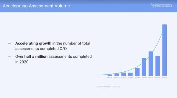
Charts need headers and labels. I presume they removed the y-axis.
They could explain how they are growing on top of just showing the chart.
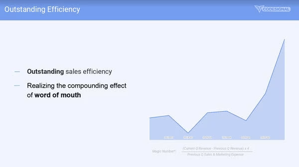
You have to squint to the bottom to see the chart is a magic number.
Don’t use superlatives like outstanding.
If you mention word of mouth then explain this as a go to market strategy slide that is working and how.
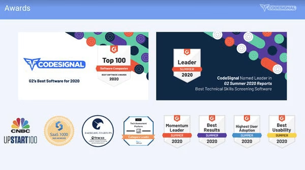
No one cares. Don’t bother adding these unless you are in Gartner Magic Quadrant.
Do not end your deck like this. Quotes are also super lame.

Deck Collection
See the rest of the collection here:




Comments (0)
There are no comments yet :(