


This is the CrowdBouncer pitch deck to raise their $437.5K series-A round in 2014 lead by Rand Capital. Ok, they said it was series-A. This isn’t a real series A so I’m calling it an angel round for the sake of looking for it.
About
CrowdBouncer provides an API-driven solution for back-office pain points of any online alternative investment platform. The company provides transactional, compliance, and fiduciary services to crowdfunding portals that allow them to close crowdfunding transactions in compliance with the JOBS Act, 2012.
Funding Rounds
They only ever did this round.
Pitch Deck Review Summary
It’s really not a great deck. There’s more to learn about what not to do than what to do.
Structured Summary Review
Words
Words are fine, on the short end. The quality just isn’t high.
Slide length
There are 12 slides. This is on the super short end. They’re not great and they don’t cover all the slides that they should.
Headers
They just declare what the slide is. They don’t have descriptive headers.
I have three levels of quality headers:
- Slide title: Founders copy the Sequoia outline without understanding they are not just meant to write ‘problem’
- Highlighted title: The slide header lightly calls attention to the core point but doesn’t explain why. ‘Productivity is the holy grail’
- Explained problem: The slide is fully explained so you understand the content without reading. ‘Staff that want to work are 17x more productive than staff who feel they simply have to work’
CrowdBouncer are in camp 1. They just grunt a word.
Appearance
It looks like a template from PowerPoint…
Narrative
There isn’t really a narrative and the slides aren’t in the ideal order.
Structure
It’s a bit of a mess.
Slides
There are 12 slides which is on the short end.
Slide by Slide Review
No one puts legal stuff in their pitch deck.
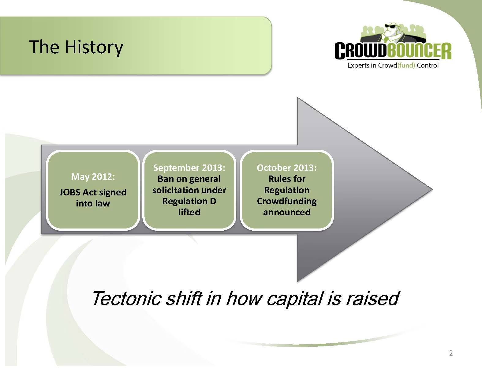
Explaining the industry through regulation change makes sense for them. There is no evidence of a tectonic shift.
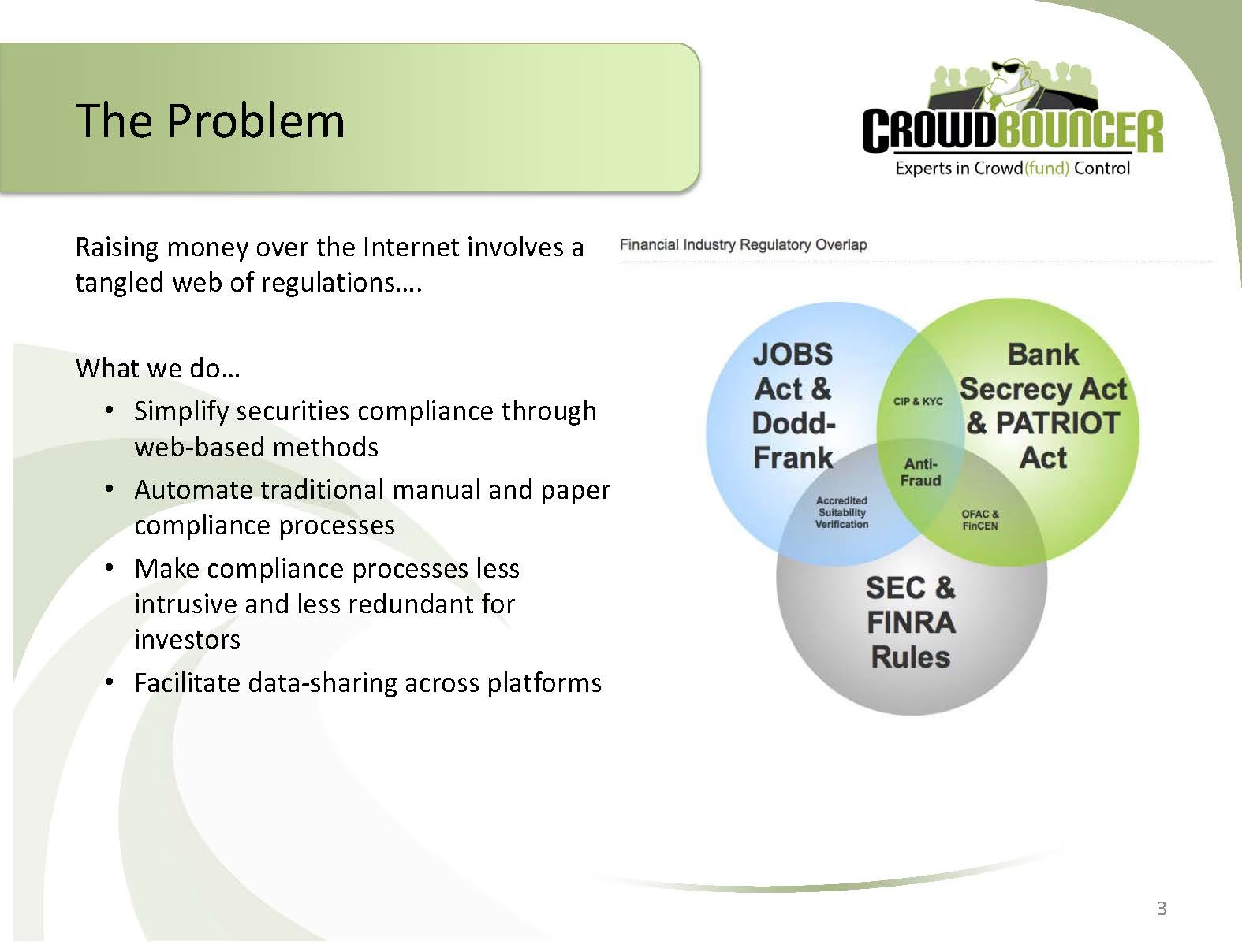
This isn’t a problem slide. Is it more of a solution slide?
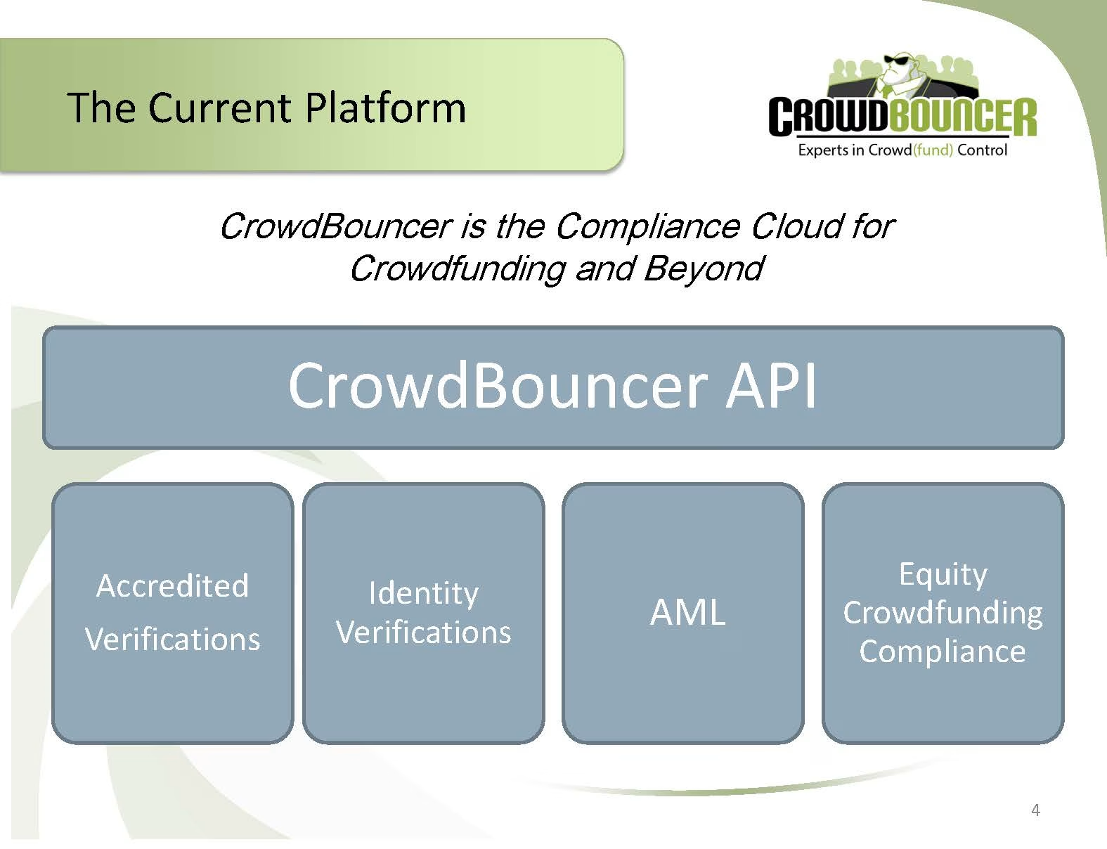
They haven’t explained anything to me to understand why this is needed. The slide is very basic and doesn’t communicate the team is smart.
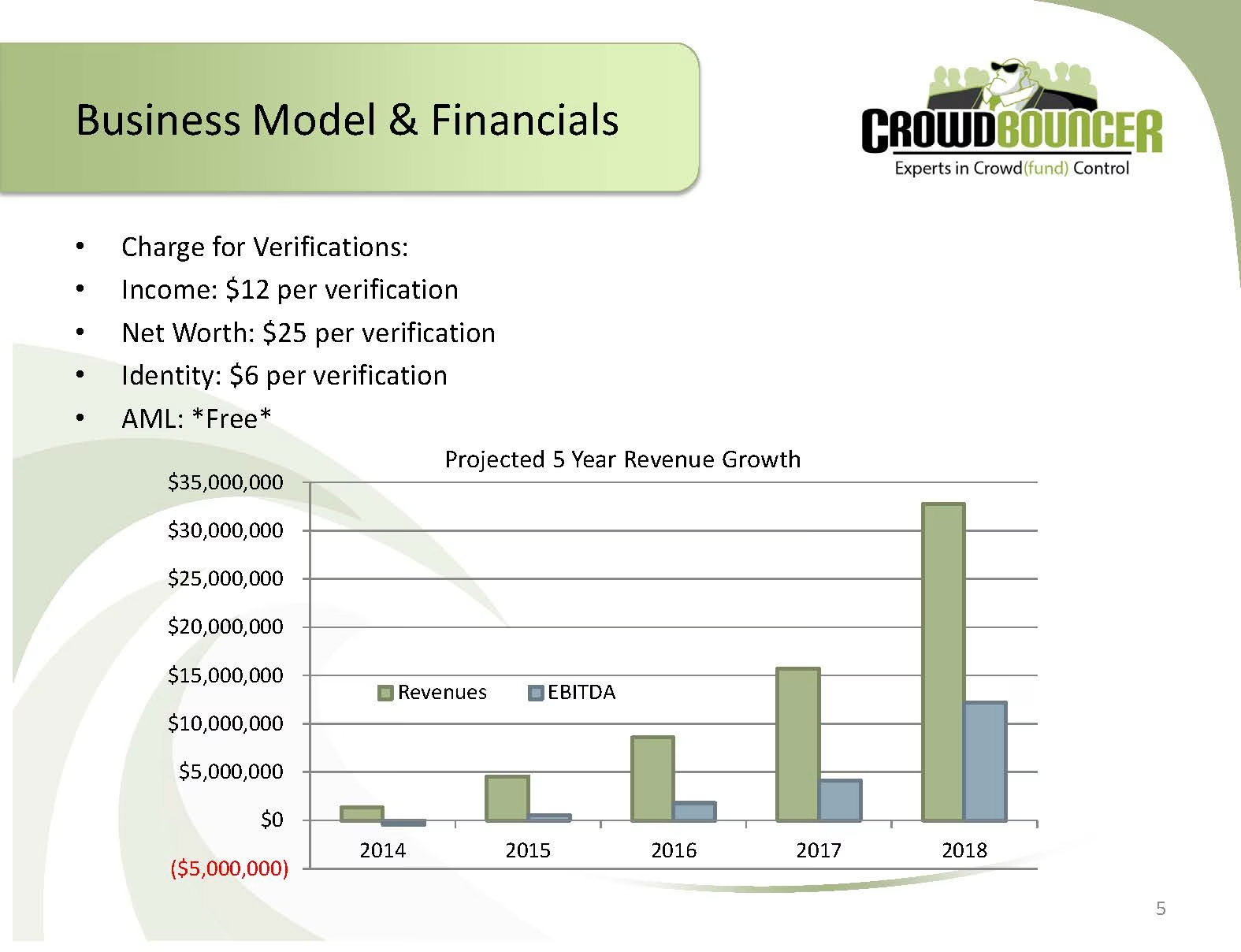
It’s way too early to be getting into financials. Why are they leaning into financials when their revenue is zero and nothing is proven yet?
Ok, so this is how they make money. I don’t have an indication of the market size.
Very low-value traction slide.
Stick sources in the footer with size 8 font.
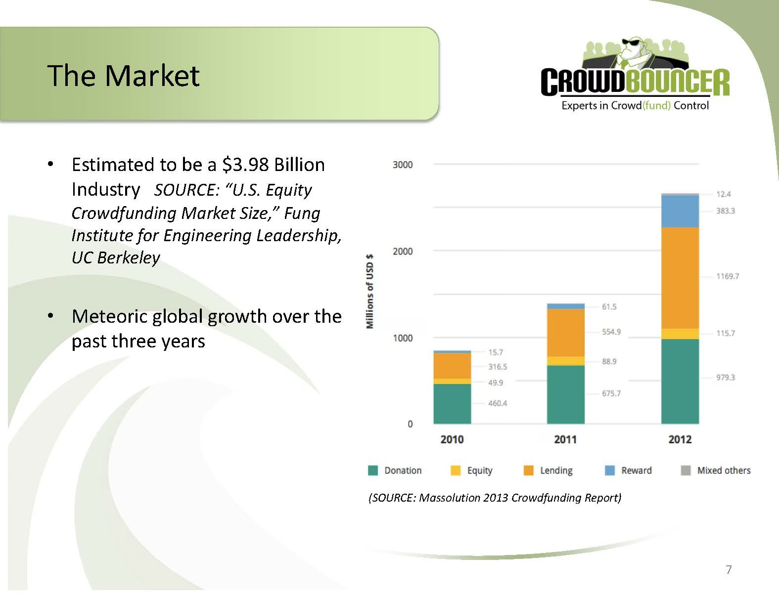
Don’t use superlatives such as meteoric.
What is the $4b? Is that actual revenue they can capture? Not much thinking has been put in.
This is one of the lowest forms of traction slide. I wouldn’t even look at this slide as an investor. Don’t do this unless you have nothing else to show.
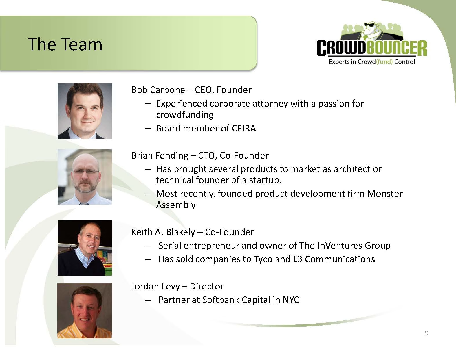
The team slide is fine. God the logo is terrible.
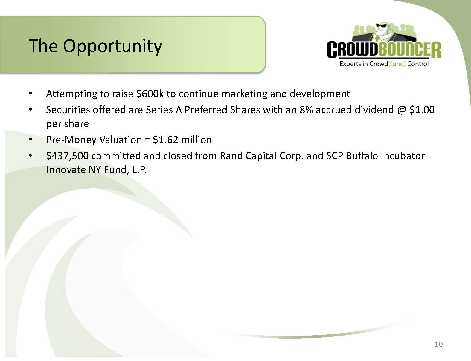
This is the ask slide, not opportunity in the traditional sense.
Don’t equivocate with a word like attempting. It’s small dick energy.
Don’t put this level of detail on a slide. Why would you want an 8% accrued dividend? 27% dilution is fairly high.
Interestingly they only raised $437.5k. So they didn’t raise after this deck.
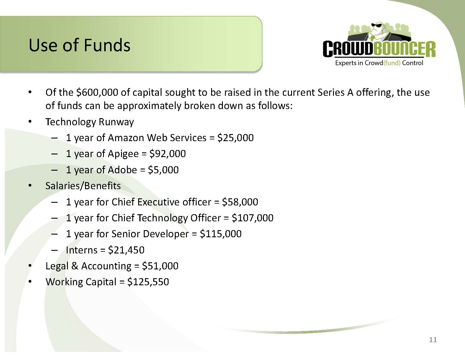
They just said they want $600k. Don’t repeat yourself.
The details on the slide are not interesting. I would rather know what milestones will be achieved.
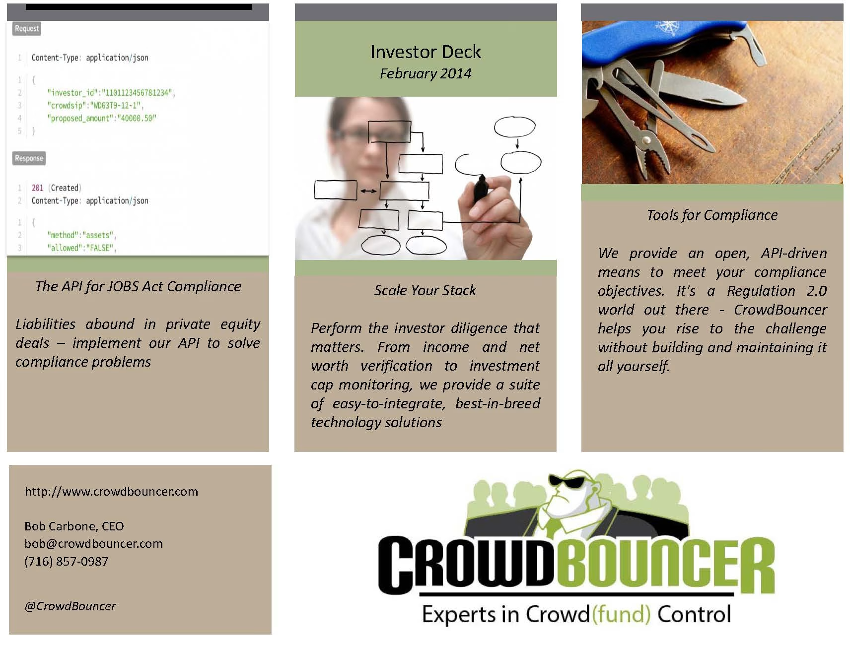
This is a weird slide.
Deck Collection
See the rest of the collection here:





Comments (0)
There are no comments yet :(