

This is the Heydey pitch deck to raise their CA$2m (So $1.6m USD) seed round in 2019 led by Innovobot. The financing round also included investments from Desjardins Capital and some strategic investors with marketing and retail expertise. They were founded in 2017.
About
Heyday is a retail-focused Conversational AI platform designed to bring the in-store experience online and create a more personalized, delightful, and high-converting customer experience. Our AI-powered chatbot gives customers an instant, self-serve, first line of support, and triages conversations to dispatch them to the right expert when necessary, whether it’s an in-store associate or a customer service agent. Retail brands across 77 countries use our industry-leading solution in verticals like Fashion & Apparel, Home Furnishings, Beauty & Cosmetics, Food & Beverages, and more.
After founding the company in 2017, Desjarlais and his partners essentially bootstrapped Heyday for its first two years. They were able to develop the product, build out a 23-person team, and attract big-name customers with basically no marketing budget to speak of, he said.

The company now will have the opportunity to promote its service much more widely after closing the funding. They’re planning to use the funds primarily on sales and marketing.
Funding Rounds
| Announced Date | Transaction Name | Number of Investors | Money Raised | Lead Investors |
| Mar 11, 2021 | Seed Round – Heyday AI Logo | 2 | CA$6.5M | — |
| Apr 25, 2019 | Seed Round – Heyday AI Logo | 2 | CA$2M | Innovobot |
Heyday Pitch Deck
Pitch Deck Review Summary
It’s an ok deck for the stage the company is. I find it a little hard to understand what they are doing. It looks like it’s yet another benefits company, but they are trying to make out it’s a payments company. That doesn’t compute.
The deck looks nice, it’s easy to read. I would probably take a meeting with them to see if it is actually interesting, which is all you need to hope for.
You can probably rip off some inspiration on how they constructed slides.
This deck is very strong in a number of ways, but it is also a little hard to follow and requires the reader to invest some time.
It is very apparent that the team really knows their business and is smart. They probably were consultants. They generally structure their thoughts in a fantastic manner and insert cogent points. There is certainly a lot to learn.
My bet is that this is only a part of the deck.
Structured Summary Review
Words
They swing between too little text and too much on occasion. They don’t have a great balance. Frequently there is no text and just images which is annoying. The deck is fairly basic, so the lack of text is not a huge issue, it just doesn’t communicate that these guys are really smart.
Slide length
There are no page numbers which I find really annoying. They put their logo where the numbers should be. I put the logo on the left-hand side.
There are 40slides. This is on the long end. But there’s not much on the slides so this isn’t that much of an issue as you can flick through quickly. But there are a lot of pointless slides. Slides, like we are featured on websites, are the crappest form of traction. I only ever include these if I really have nothing else to show. If you have a bunch of logos and you just launched, that’s impressive. It’s not after a few years.
Headers
The headers are rubbish They just declare what the slide is. They don’t have descriptive headers.
I have three levels of quality headers:
- Slide title: Founders copy the Sequoia outline without understanding they are not just meant to write ‘problem’
- Highlighted title: The slide header lightly calls attention to the core point but doesn’t explain why. ‘Productivity is the holy grail’
- Explained problem: The slide is fully explained so you understand the content without reading. ‘Staff that want to work are 17x more productive than staff who feel they simply have to work’
Heyday is in camp 1 and occasionally 2. They make an effort, but don’t make enough effort to make reading the deck effortless. When you have crappy headers it makes the entire deck a pain to read.
Appearance
It’s an attractive deck, likely done by a lower-end designer. I doubt the founders did this themselves.
My issue with design is it can mask the bigger issues of the content not being great.
There are definitely slides you can take structuring and design inspiration to apply to yours.
Narrative
The deck generally flows, but I wouldn’t say that they have a narrative. There is a fair amount of fluff which is distracting.
I generally understand what they are up to but I don’t feel compelled.
Structure
Things are aligned well. There is negative space. It’s fine. I can be a little critical, but frankly, I wouldn’t spend time changing it as it’s certainly enough to get a meeting. That’s all you need.
Slides
They don’t get into too many details about anything. It’s very lightweight.
They don’t cover all the slides that they need to, but I’m pretty sure this is only part of the deck, so my stating what is missing isn’t terribly apt.
Slide by Slide Review

The text is a little jarring as it’s large. I typically make the logo more prominent so I know what deck it is if I’m going to refer to it later.
The description gives me a solid idea of what I’m getting.

I start by explaining what it is the company does so I get it. This is a little indulgent. Big whoops. You’re in a list. This goes in the traction section… if you want to include it.
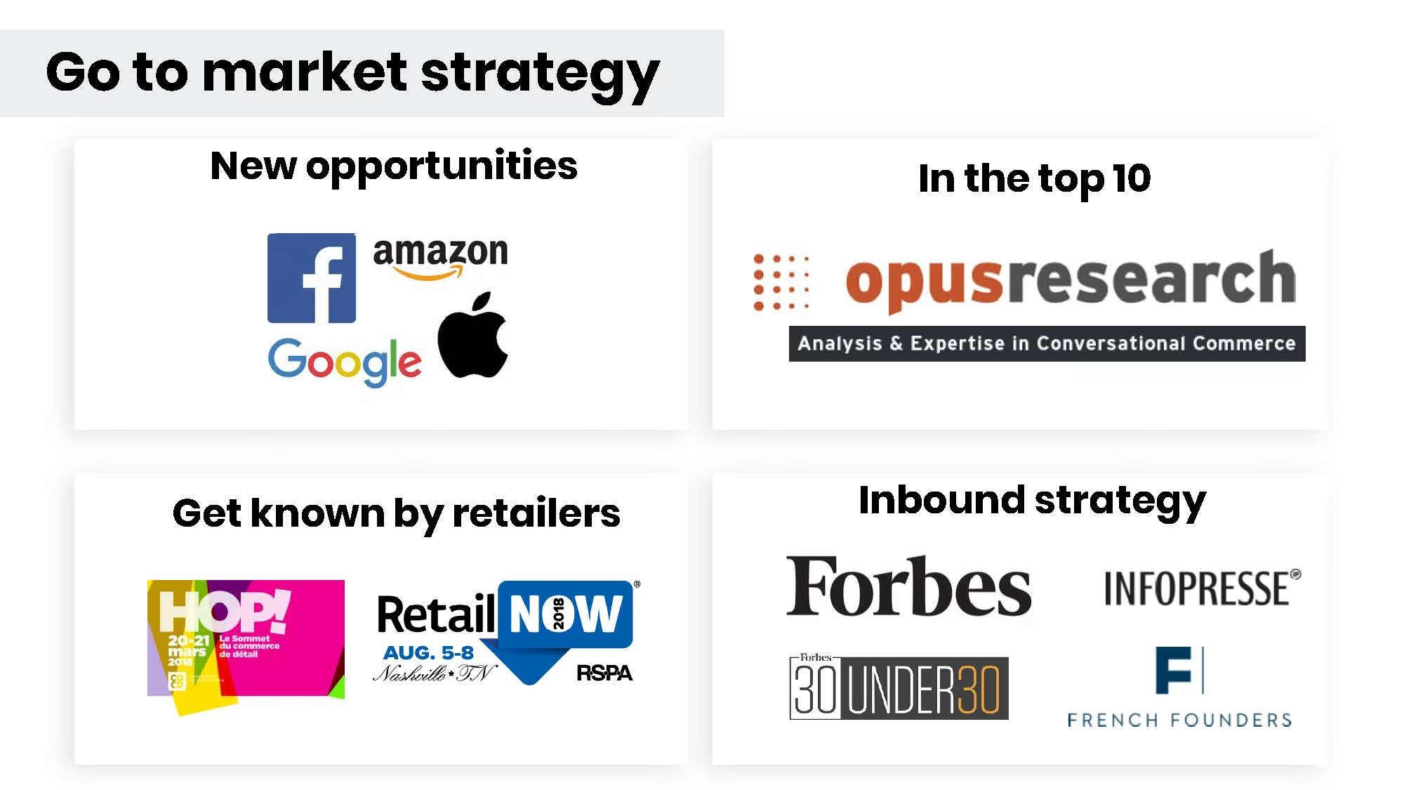
Again, really? Do you want to start here? Anyone can hire a PR company to get featured and most have no integrity as it is pay to play.

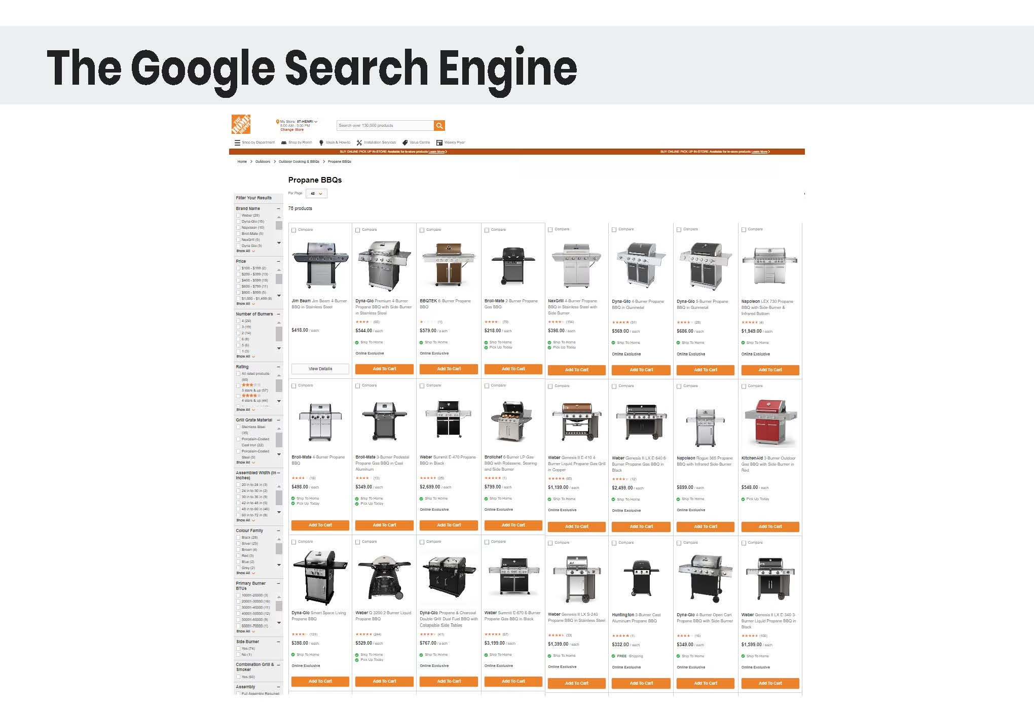
These types of slides are so lazy. Of course, you are going to say this! Prove it. Back it up with two charts and source them. Let me decide if it’s the “future”.
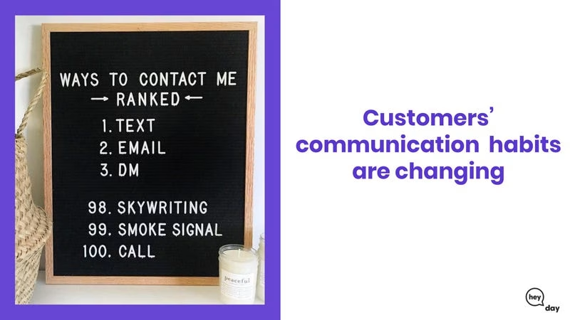
Again, prove it. Whilst the image is true, it’s super lazy as proof. You want to go beyond the what and into the why.

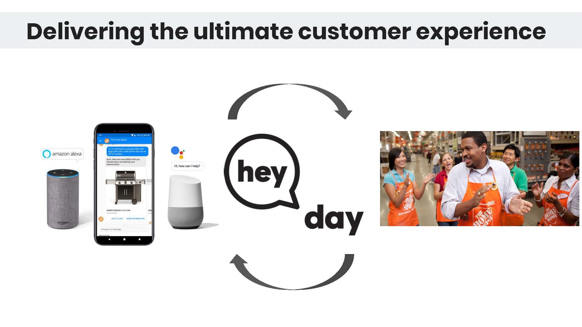
OK, another random image.
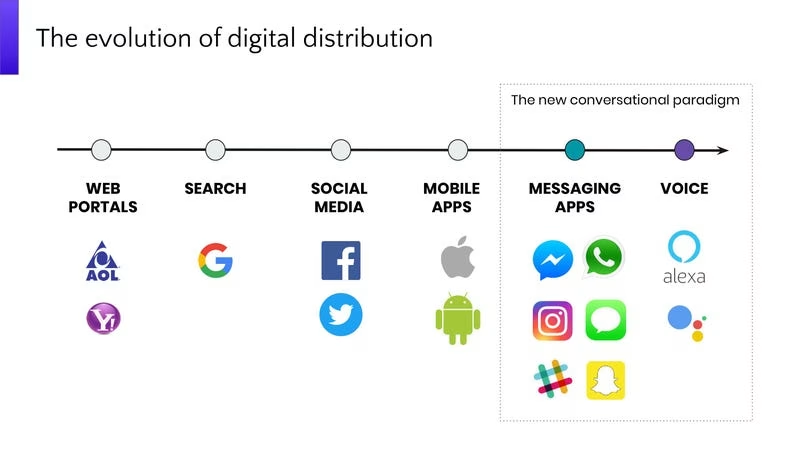
This is better. I like slides where you put in a bit more effort. What’s missing is the “so what?” What’s the takeaway?
Why is this a whole slide? Couldn’t this be a comment on another one?
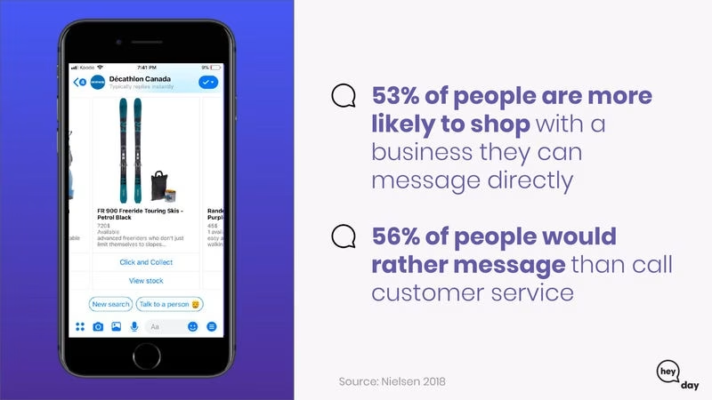
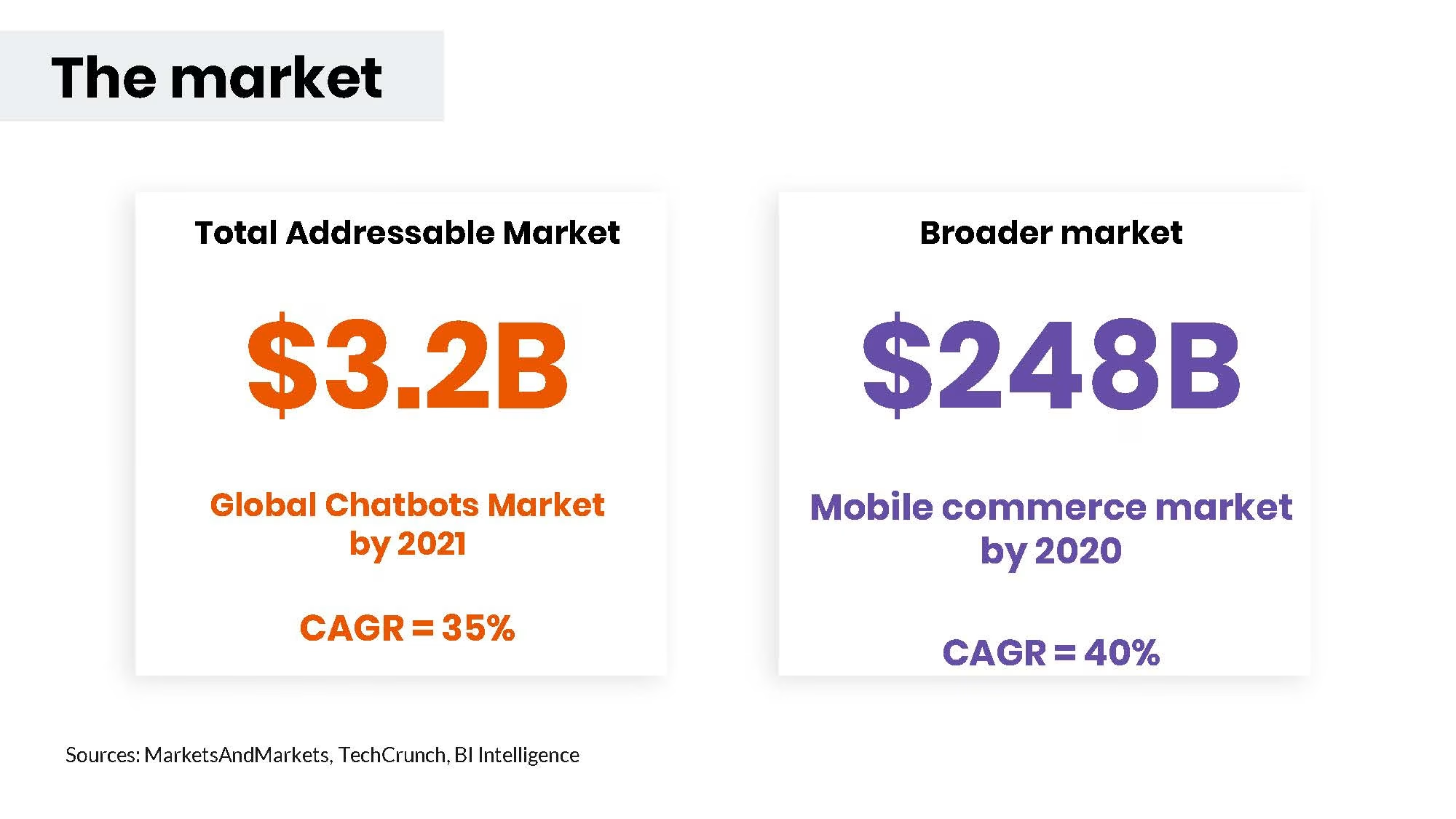
The deck is getting a little repetitive now. The stats are good, is the image adding a lot? If it doesn’t sell delete it.
Lazy slide.
Shouldn’t this be at the start of the deck?
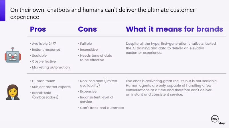
They’re just introducing chatbots now. They didn’t link this to the evolution of the industry.
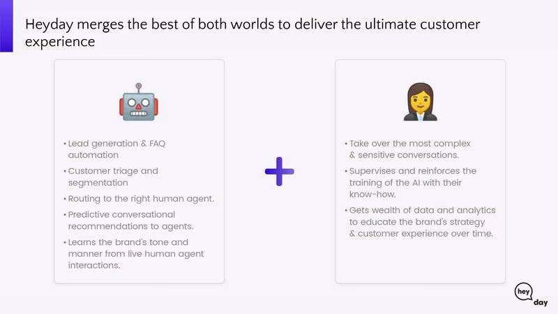
The slide is far too wordy. There are no headers on the left and right side. I’m forced to read the content to get the point (I didn’t read it).
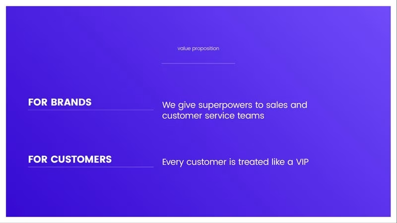
Why in god’s name is the value proposition in so small text? It’s bizarre. Why aren’t they providing specific examples of use cases?
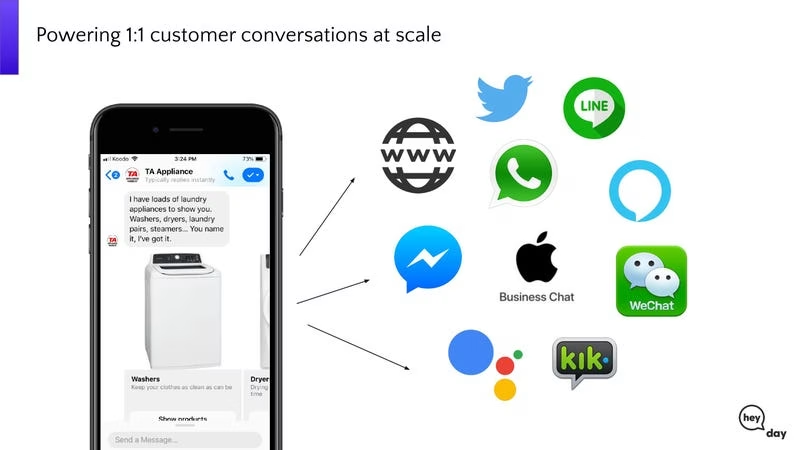
Don’t understand. These are integrations?
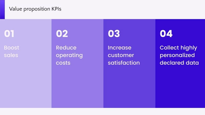
The value proposition was two slides ago. More repetition.
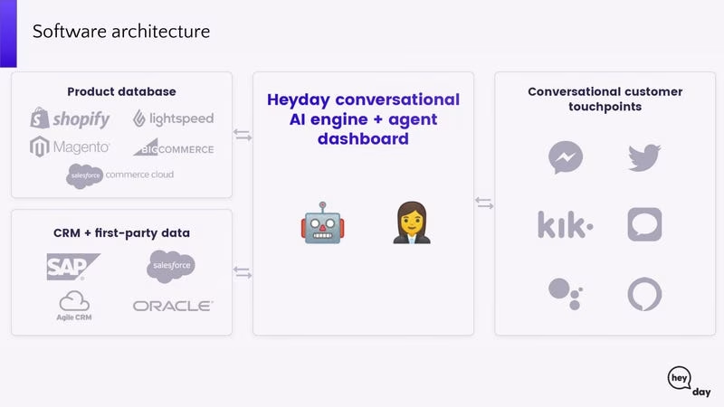
This isn’t architecture. It’s broadly how the product works.
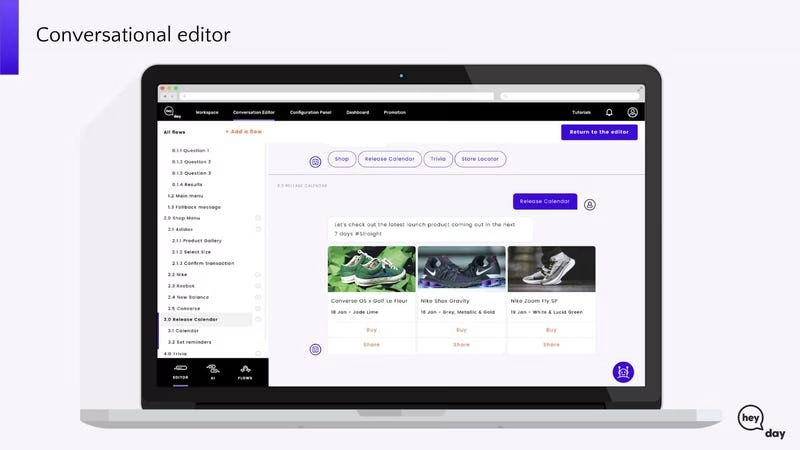
Now there are 5 slides of the product with a short title and zero explanation. Very low-value add.
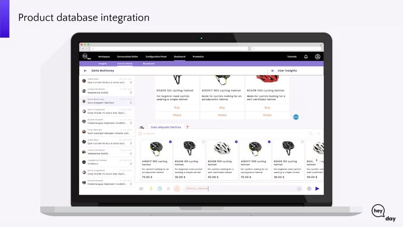
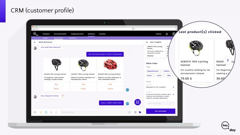
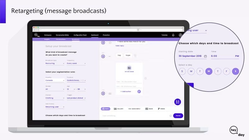
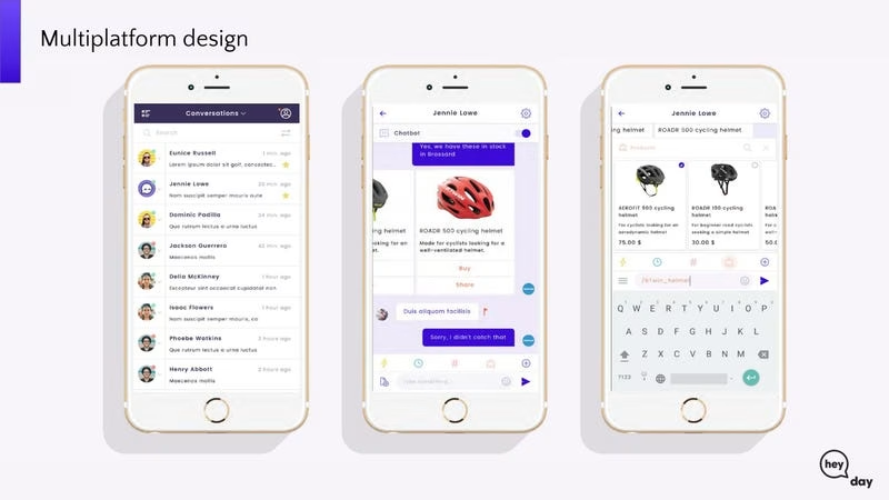
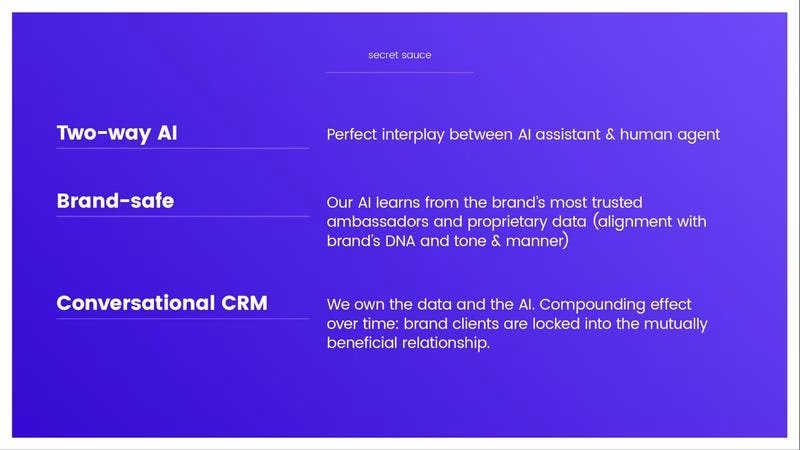
More of the esteemed tiny ass text.
Not really sure how this is particularly. They have a good UX and they do machine learning.
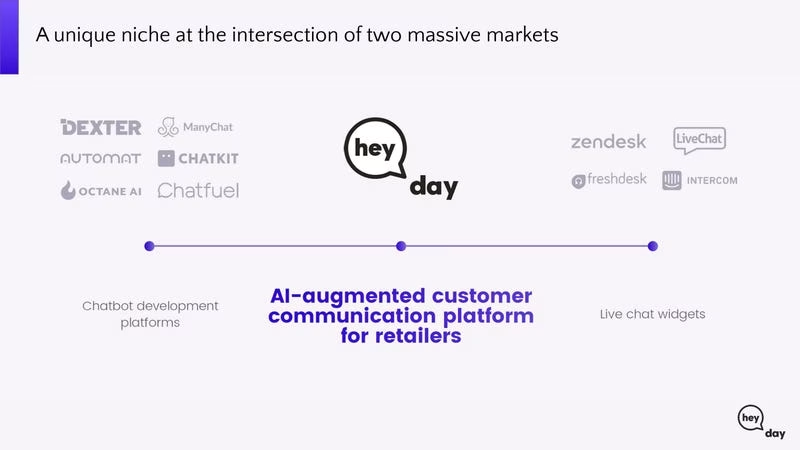
Is it really a niche? I’m not sure about the differentiation.
Lazy slide. I’m more interested in metrics like average deal size.
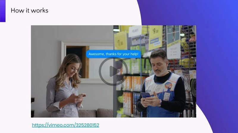
Just send the demo link when you send the email to investors with the deck.

I don’t like vision slides. I’m more interested in how big this can get.

Never put in interstitial slides. Your deck should not be long enough to need them.
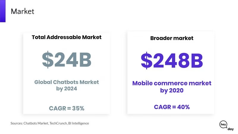
It’s an ok slide, but it’s lazy as usual.
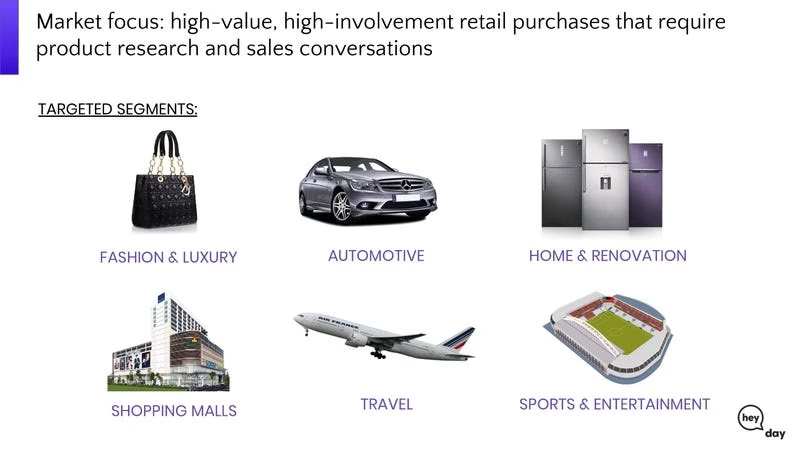
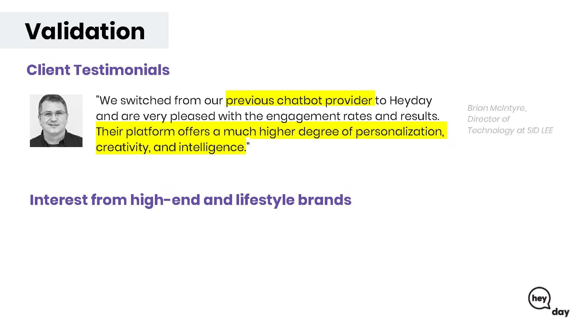
Lazy. Should have indications of the number of customers at a minimum.
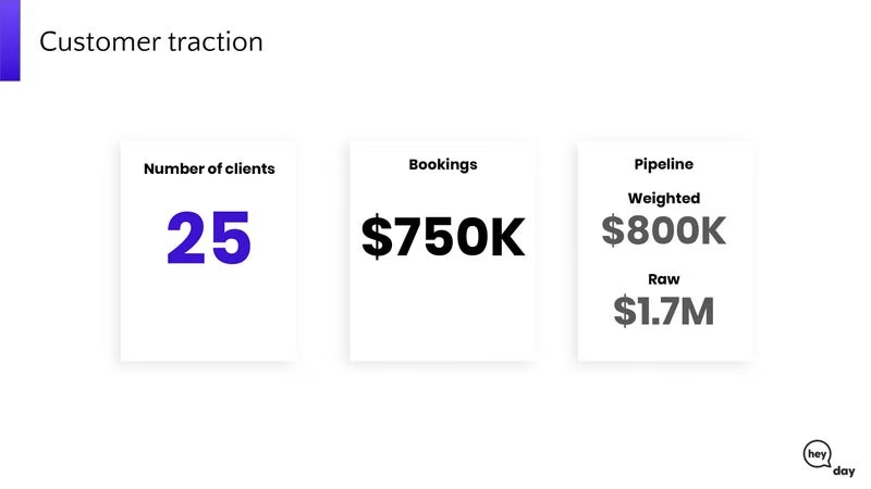
This is fine for a seed-stage company. Pro SaaS companies go further and show things like cohorts.
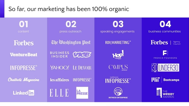
In principle the slide is ok. It’s better than most. This doesn’t scale though. I know they’re been bootstrapping, but if I’m going to give you money I want to know how you are going to spend it. If you haven’t done any marketing tests etc, you’re going to have to figure it out with my money.
Such a pointless slide.
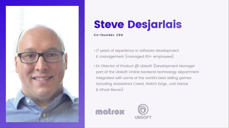



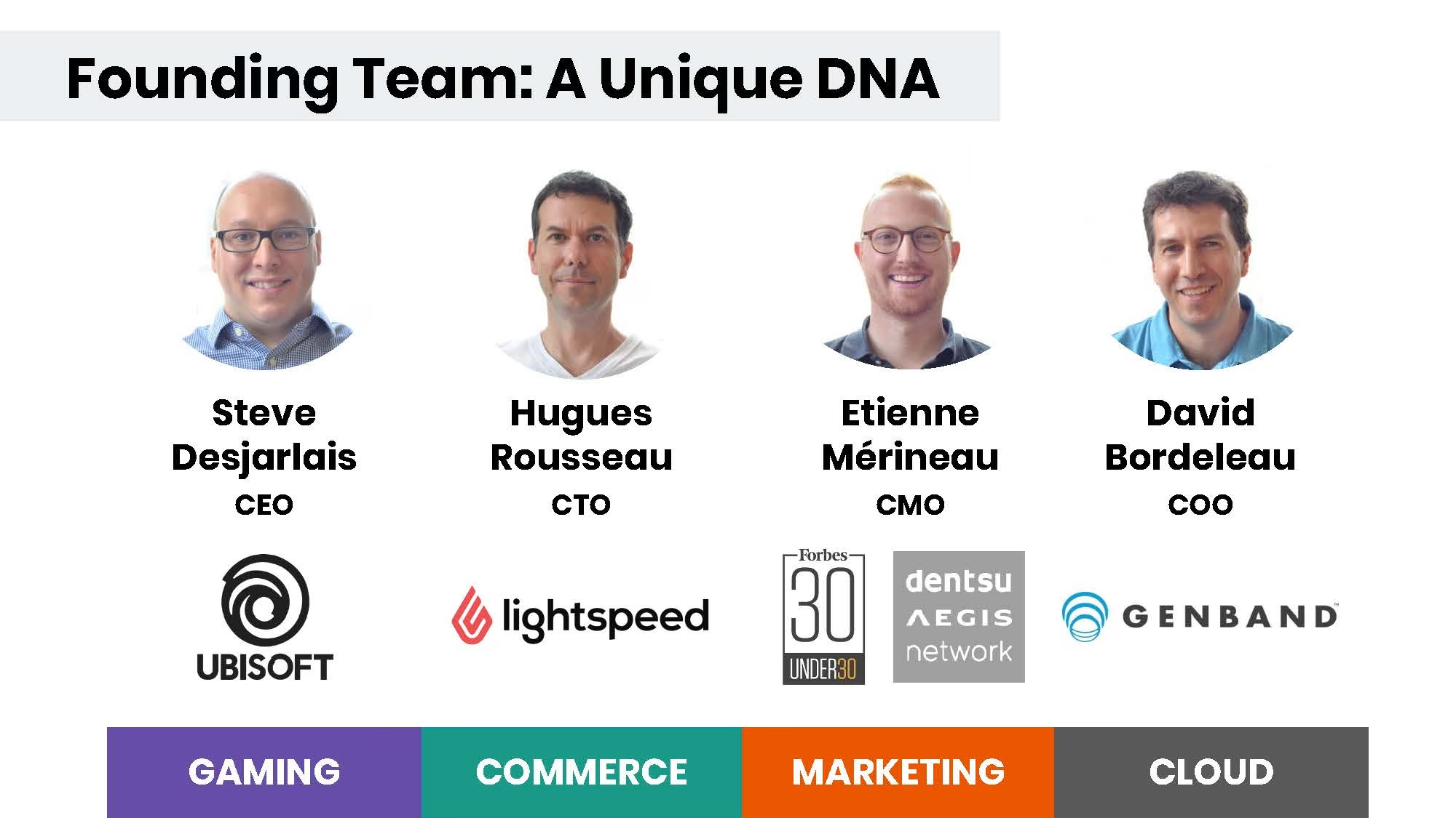
You should have your team on one slide unless you have a bunch of ballers, in which case you can have two.
If you’re not necessarily a known quantity but you’re experienced, then I’m not totally against these 4 team slides. It’s a bit overkill though and makes the deck longer.
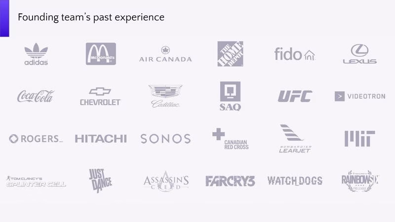
Why is this needed after 4 team slides?
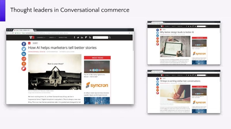
How does this add value?
Investors have your email already. Why is this needed?
What do you think about the deck? Did you get any learnings?
Additional Pitch Deck
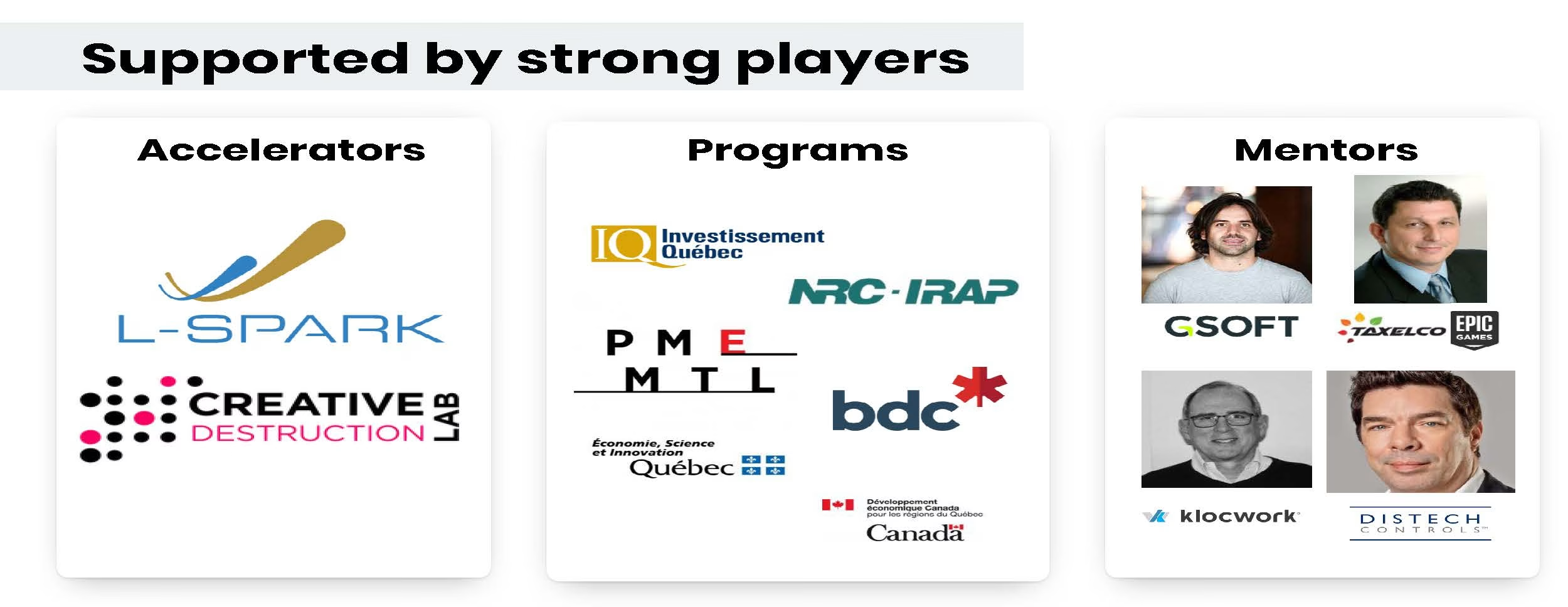
It seems they went through an accelerator called L-SPARK in Canada. I managed to find another deck from them in Jun. 11, 2018. The file says “heyday-shortdeck-shareable” so I presume it’s a sanitized version of the file.





Deck Collection
See the rest of the collection here:




Comments (0)
There are no comments yet :(