


This is the Front series c pitch deck used to raise a $59m round led by Eric Yuan, Frederic Kerrest, Jared Smith, Jay Simons, Mike Cannon-Brookes, and Ryan Smith. They were founded in 2013 and have raised $138.3m to date.
Their previous decks were good, this one is lame.
About Front
Front redefines work communication with the first shared inbox for teams. By unifying your email, customer communication channels, and apps in one platform, Front helps teams collaborate efficiently and have more context and visibility into every conversation, to work faster and better together. Today, more than 2,500 businesses rely on Front to power their work communications. Founded in 2013 by Mathilde Collin and Laurent Perrin, Front has raised $138.3 million in venture funding and has 50+ employees in its San Francisco headquarters and Paris, France office.
Commentary from the Front Founder
Once is a fluke, twice is a coincidence, three times is a trend… I’m once again making public the deck I used to raise our latest round of funding!
Based on the feedback I’m getting from readers, this is easily one of the highest-leverage activities for me: it takes about an hour to put it together, and then hundreds of thousands of people can see it and use it in their own entrepreneurial journey. The internet is truly a beautiful thing!
The Process
Why did we raise money now? The framework I used for our Series A was just as helpful today as it was 4 years ago. It’s all about meeting these 3 requirements:
- Feeling generally good about the business and where it’s going
- Having reached the milestone you had set for the previous round
- Needing the additional resources to reach a new, ambitious milestone
#1 is both the most overlooked and the most important one. You need to be confident in what you’re doing, so that you can project this confidence to investors and inspire trust and respect. Strong core metrics are by far the best way to help build this confidence. Not so much because that’s what investors are looking for — of course, being a growing, healthy business never hurts when trying to raise funds — but because if you truly believe that these are the important metrics for your business, then seeing them trending in the right direction will genuinely make you feel good.
Read: Fundable startups are fundable
Last November I felt good about the business for a few different reasons:
- We had gained unprecedented clarity on how to execute our go-to-market strategy.
- We had brought in great new executives (we had just announced that Anthony Kennada had joined as CMO).
- We had had 3 quarters in a row of hitting more than 100% of our goals — and they were ambitious.
- Our current investor showed interest in leading our next round of funding (you can only know for sure when it’s signed, but the signal this sent was very helpful).
- With 2 years of runway in the bank, we didn’t need to raise money. Being under the gun isn’t good for negotiations.
Regarding #2, during our Series B, we stated our intention to 1) become a good email client and 2) build an extensible platform.
- We went from 20% of DAUs using Front as a replacement for Gmail or Outlook to 50%.
- More than half of our customers now use our platform.
This was enough for me to consider these milestones passed.
Finally, for #3, we had established new milestones and a clear need for resources to get there. Our newly defined go-to-market plan led us to make new, big investments. Between our San Francisco HQ passing 100 employees, our Paris office growing 200% year-over-year, and a newly opened office in Phoenix (we’re hiring!), this additional capital would ensure our operations could expand at a steady pace. And, last but not least, the basic premise of Software-as-a-Service is that the software should get continually better (to justify the continuous subscription to the service). Therefore we cannot stop or slow down our investments in building the best possible product.
Once it was clear that we were meeting all 3 requirements, there was no time to lose. When it comes to fundraising, setting a tight timeline always plays in your favour. This time around, our CFO told me it would be impossible to make a deck and pitch within 2 weeks; so I took it as a challenge and we did.
Feedback I’ve Received
If I had to summarize what caught investors’ interest, here is what I’d say:
- Front is a mission-driven company (slide 3)
- With a proven product opportunity (slide 6)
- Hiring excellent talent at a fast pace (slide 7)
- Showing consistent revenue growth (slide 14)
- In a huge market (slide 12)
- Where “hot” companies haven’t delivered on their promise (slide 13)
- Having made significant progress in their go-to-market (slide 14)
- With a very ambitious long-term vision (slide 23)
That being said, we still have a lot to figure out:
- How can we scale inbound traffic?
- How can we talk about Front in a consistent way? (“You mean you’re a help desk AND an email client ?!”)
- How can we keep bringing new leaders on board? (We’re hiring for a CPO and a COO right now!)
- How can we balance our long-term product vision with the short-term, pragmatic needs of fast-growing customers?
On Valuation
Here’s how I navigated the conversation around Front’s valuation:
- I didn’t provide any guidance on valuation. Instead, I simply asked that investors give me a fair price. That, combined with a very short process, helped make the round competitive and eventually played in our favour.
- Once again, I didn’t take the highest valuation, but instead optimized for who would be the best partners at this stage of the company.
- I didn’t raise more capital than necessary because I wanted to make sure we wouldn’t get too comfortable, take our time, and become complacent. We still have a lot to figure out!
On Investors
Raising funds from operators instead of traditional VC funds wasn’t something I had planned. It happened that 2 of them showed interest, offering to invest larger sums than I would have thought. Bryan Schreier, partner at Sequoia and member of Front’s board, then suggested that we structure the round that way. I turned the idea into a deliberate strategy and reached out to a few more people. That’s how we got these super-angels to lead the round.
I’m very grateful for Bryan Schreier and the whole Sequoia team, who have been amazing partners during this process. They wanted to lead the round, but instead always pushed me to do what was best for Front and optimize for the long term, rather than what was best for them in the short term.
Structured Summary Review
Words
The words per slide are too sparse. They really don’t explain a lot of slides properly.
Slide length
There are 27 slides. This is the top end of ok. The reality is there are a bunch of dumpster fire slides. 4 slides can easily be deleted.
Headers
The headers are ok. They are better than most. They could be a lot better.
Appearance
Super simple design. This is what you want to aim for which is a low bar. Stop making fancy slides. I have clients that ignore me and do fancy stuff and it always makes it worse.
Narrative
Headers are my jam. It’s a TED talk.
They do better than most startups but they aren’t great.
Structure
There are no page numbers.
Don’t bother writing “confidential” at the bottom of the slide.
Slides
I feel like they gave up trying in this deck. The last two decks they wanted it. This deck is like whatever, these money bags are going to hand it over. We have good traction, they know us, so whatever. Make something as we aren’t pitching anymore. They have Excel files of traction.
Front Series B Pitch Deck Tear Down
I love the decks Front make. There’s just so much best practice they do. This includes:
- Narrative
- Slide structure
- Consistent use of headings to tell the story
- Graphics
- Focus!
Let’s go through the deck slide by slide.
The cover is great.

I’m sure Mathilde has a reason for a child photo and a statement but I don’t see it.
She already has relationships with investors so she can be a little vague to new investors, presumably, she is talking to the slides.
You shouldn’t have a wtf slide like this.
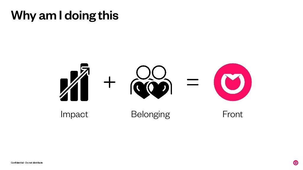
Never repeat a slide title. It’s lazy. Don’t even do this when you are making a presentation on stage.
I’m jaded… so when I see Front is a function of impact + belonging I think about that asshole Adam formerly from WE.
Don’t get high on your ego supply.
Wow, and now we are three slides in and it is all me, me, and me in the header 3x. Wtf is “work happier” as a slide? Is this a TEDx talk?
Bear in mind I’m writing this as I read. It’s a stream of consciousness. I’m not doing a McKinsey analysis. This is valuable to you since you’re only reading these decks to get learnings to do your deck.
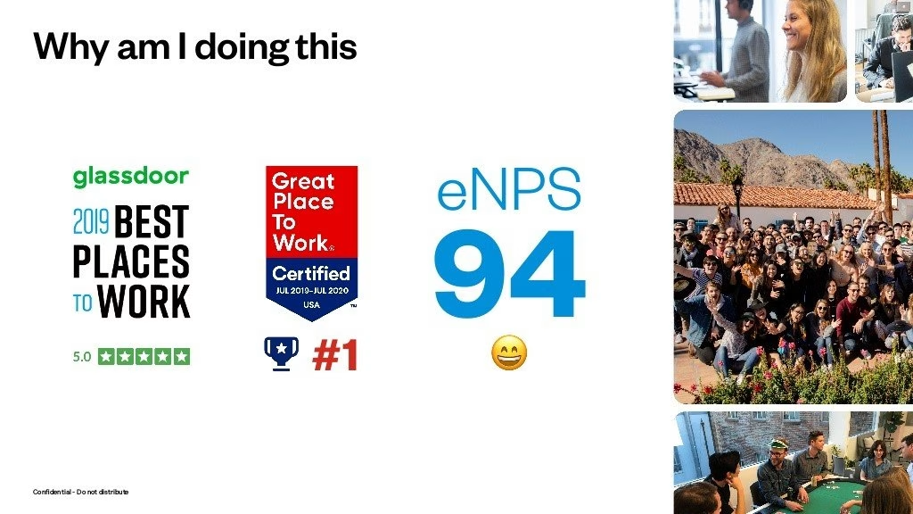
Ok, slide 4 is me again. Twitter and Medium posts are for this BS.
You’re doing this because you are a nerd and you’re going to likely get rich. Get over it.
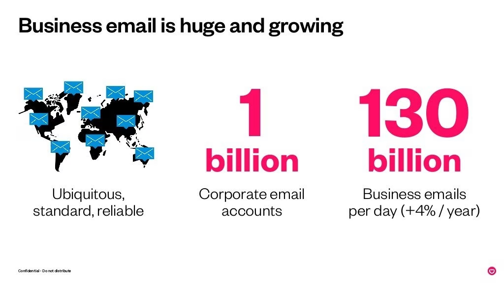
The first 4 slides should be deleted. We are finally starting the deck.
Firstly, start with what it is you do. Unless of course, investors know you personally so you can skip that. If they don’t do what I say.
Well, I’ve written on their last two decks. I see that they are trying less. There’s a lot of confidence which I don’t personally like.
The design feels fresher than before. I hate the size of the body font. This deck was clearly assigned to a designer who does what designers do. They think pretty.
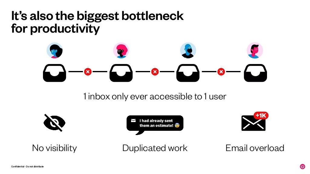
This slide has been done better than the previous two decks.
I really like the visuals. I abhor text unless it aids comprehension. This is a great slide. I structure slides differently, but it works well as it is.
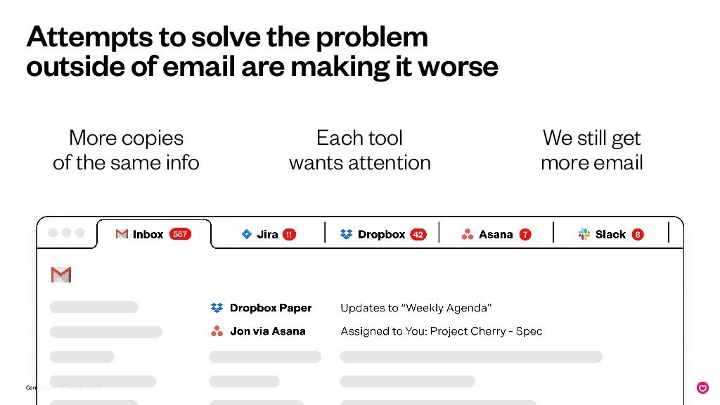
I actually like the visual of this slide. I ripped it off and applied it for a client actually.
The fact that “each tool wants attention” is so true. Everyone wants to drive DAU/MAU.
The slide isn’t actually much to look at, but when you are making slides, you realize there is some genius in this slide. What they show and don’t show is smart.
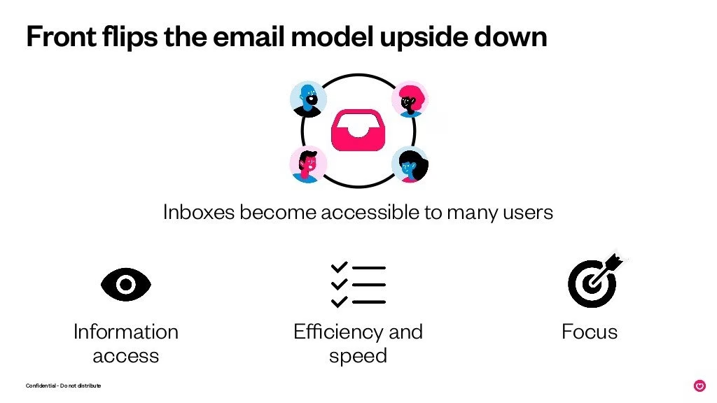
Technically, something weird would happen if you flipped things upside down, but let’s skip that.
Not sure I really like this slide. Ok, accessibility makes sense, but do the other points?
Mathilde said she decided to try to raise from scratch in 2 weeks, and I think it shows. I mean she got the money, so yay, but I’m reviewing the deck.
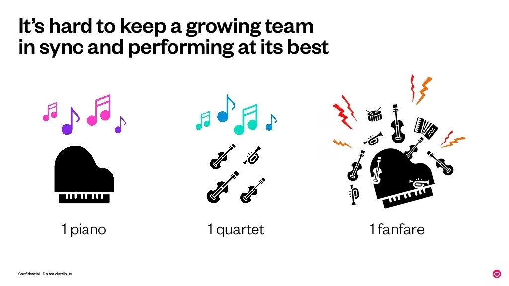
I’m starting to get a WeWork vibe.
Yes, I can see the analogy they are going to make here, but we are getting into TedX talk territory.
They purposefully break the header into two parts to communicate two points.
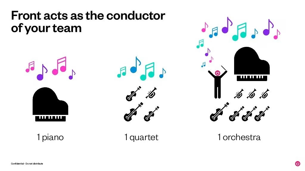
Note the header break points again – conductor and team.
I hate slides that almost look the same. It’s like playing Where’s Wally.
I just feel the content on these slides are attempts by founders to convince VCs they will be decacorns. This vision bla bla. It annoys me.
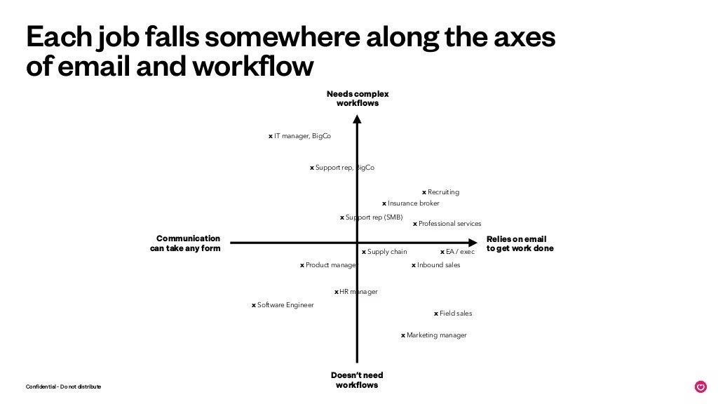
How hard is it to read the text on this slide?
Their axis’ are better than in previous decks, but this slide is a lot of effort to read.
This is a painful slide to understand.
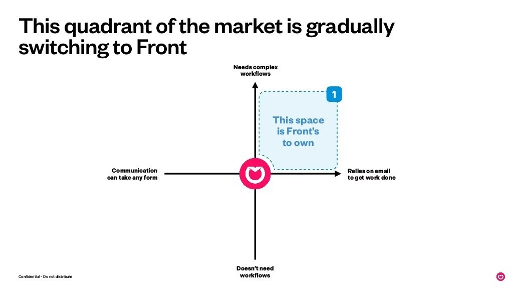
This and the previous one are competition slides. It’s like we don’t even have competition anymore. We’re the chosen ones. No one even competes against us in how we have decided on our space.
They do seem to be niching down a little to understand the space they operate in.
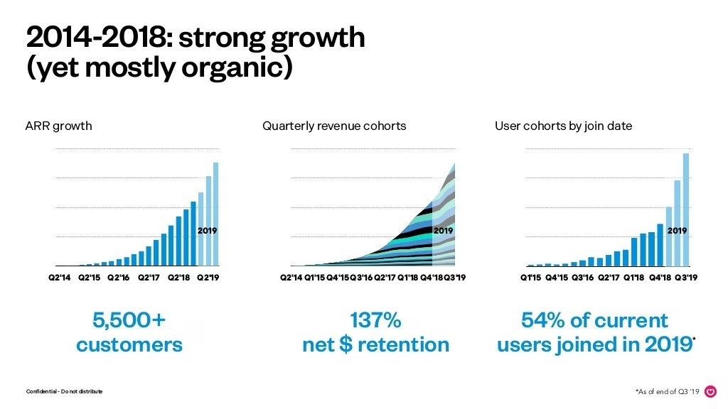
Oh gosh, the x-axis titles are horrible to read in quarters, in particular the middle one. Again I presume they feel they are checking boxes and investors will ask for the Excel.
I don’t like the left alignment of the chart headers. Think I’m going to term a phrase now of beaders (body of content header). Will be so much easier for me to explain in future. What do you think ;)?
The shading on the graphs for 20198 is a little peculiar.
In the last series-B deck, they made an effort to explain things. I feel like they think they have figured it all out now, so don’t ask questions and just wire the money.
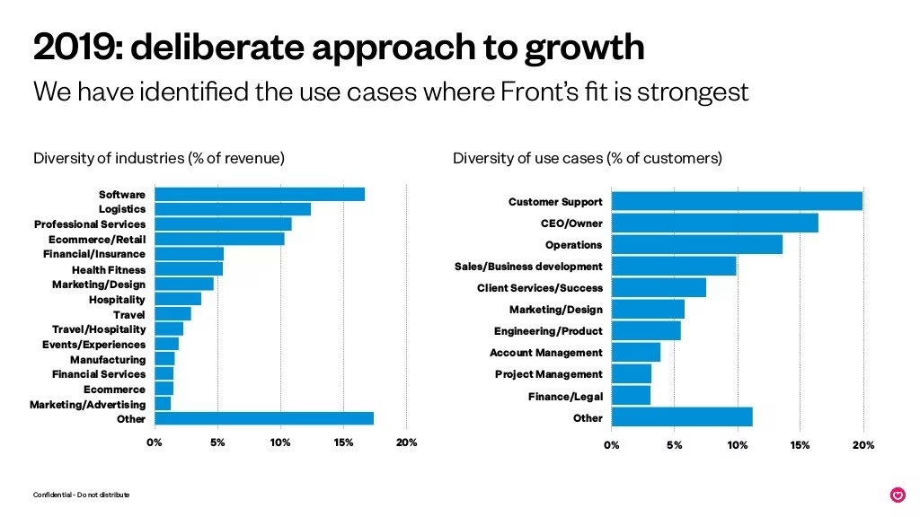
In this slide, they are saying they have it figured out but they don’t say where. It seems to be customer support for SaaS companies which is a huge “no shite Sherlock”, I could have told that to you a few years ago.
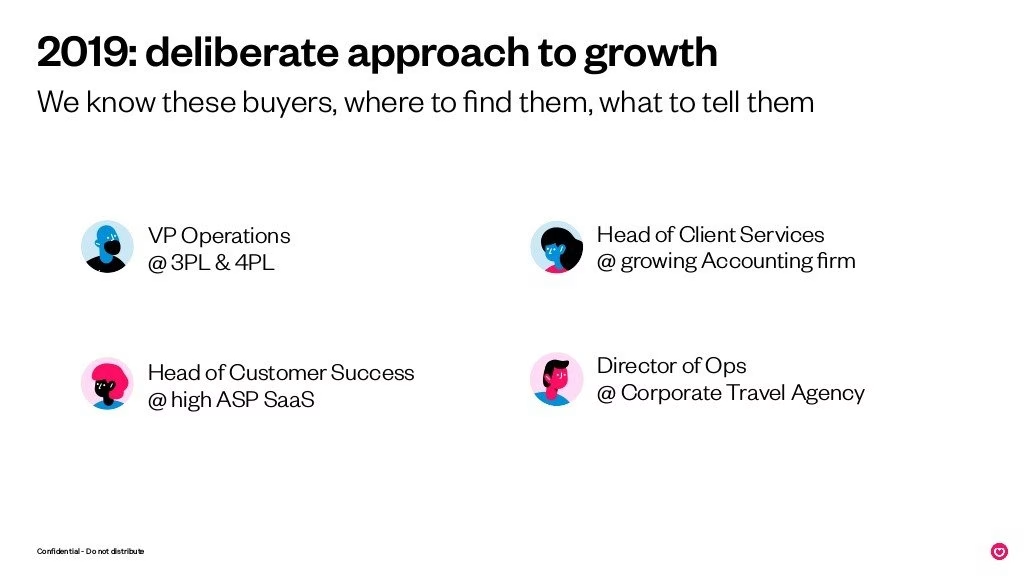
It’s clear in this deck that the founders have a lot more confidence. Their wording is very different. I don’t like it. Well in a sense it is reassuring, but in another, it feels lazy in presentation. It is cool that they show they have been learning. VCs will notice this.
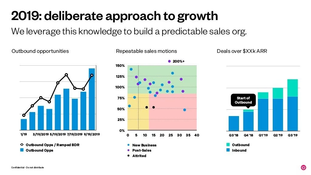
I like stacking slides with relevant charts. Stop messing about and give me what I want!
In the series-b deck, they were honest that they were figuring it out. Now they say they have. This is natural and expected.
Ok, there is a new thing, they added outbound.
There is the foundation of greatness on this slide, there’s just something I don’t like about it. I would need to actually spend time explaining. I’ve like 200 more decks to comment on… FML.
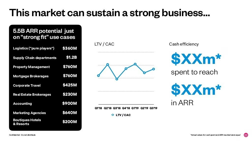
Hmm, I am conflicted with this slide. The black box is bold. There are a LOT of points. Too many. Once you get pulled into reading it could be useful.
I feel there is too much going on, at least the way the slide is structured. It’s still better than most slides.
Ok, hand on. Wtf. There is a tiny ass footnote in the bottom right. It’s inperceivable.
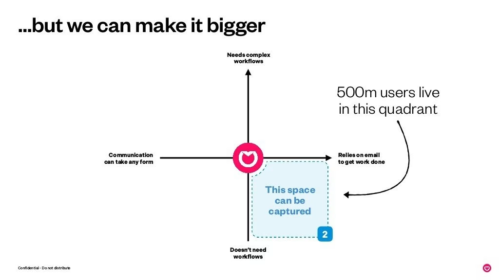
Ok, smart point. They want to expand the market. This is a nuance basic beatches don’t comprehend.
They mention on slide something (this is why you need fecking page numbers…) a similar quadrant. They are building off it. I personally prefer these to be together- well it depends.
Ok dude, if you are telling me you can access another 500m people you better bloody explain it. Because this isn’t adequate per se.
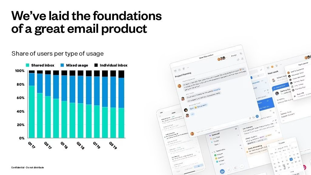
At series C you want to have your product figured out. If they are at foundations I’m a little concerned. What exactly is the point of this slide? I need to decipher it.
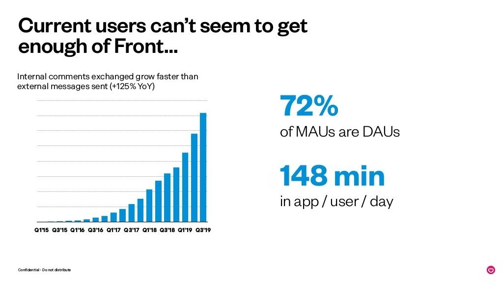
Notice the word break point.
They do not compare internal vs external here. How do I know?
The DAU/MAU ratio is solid.
Is 148mins good or bad? If this is a customer care replacement and you want minions working 8 hours a day, maybe not?
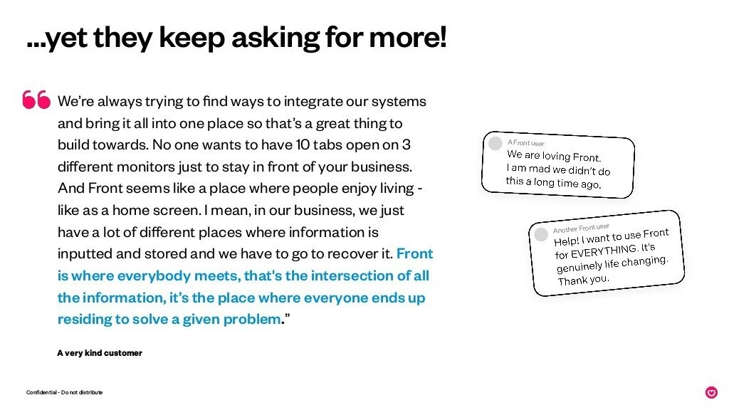
The decks keep referencing people wanting more.
Wtf, this is a crazy-ass long quote. The assumption that someone will read this is large. And it is from “someone”? yeah, I can write what I want to from “my friend”.
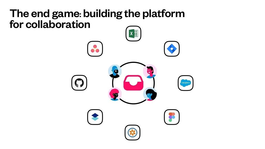
Eh, Front always has a slide or two I have no idea what it means.
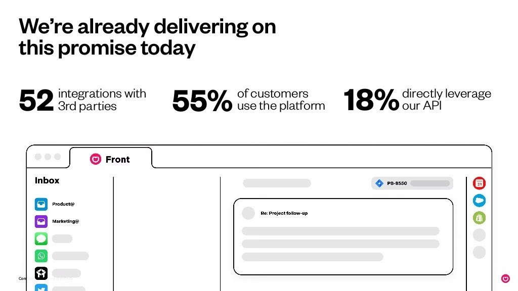
This slide was in the series-b but it has changed.
I don’t get that 52% of customers use the platform. So 45% are paying and don’t?
The bottom image has been rehashed but doesn’t make sense.
The biggest conundrum of them all. Three decks with this cryptic puzzle. Wtf is this?
Don’t do this. It’s a dead slide. you want an end slide so it is clear. Write an investment thesis if you are smart, or write a three-liner on the opportunity.
Deck Collection
See the rest of the collection here:





Comments (0)
There are no comments yet :(