


This is the Opendoor pitch deck to raise a $10m series-a round in 2014. It was released on Twitter just as they IPOd.
About
Opendoor is an operator of an online real estate marketplace used to streamline the sales process of home buying and selling.
It helps sellers to receive an offer without listing or showing their home and buyers to browse for homes on sale and instantly unlock them using the company’s application that enables customers to buy and sell properties on a hassle-free freeway.
Opendoor was founded in 2014 and is based in San Francisco, California.
In 2020 they went public through a reverse merger into a SPAC (IPOB). It valued them at $4.8b, and fortunately, the share price went up 35% on opening.
Let’s rewind. With the IPO their series-a pitch deck was shared on the Twitter. Back in 2014 when it was founded, Opendoor raised $10 million Series-A from YCombinator and Khosla Ventures. This blog is this deck.
Funding Rounds
|
|
|
|
|
|
| Dec 21, 2020 |
Post-IPO Equity – Opendoor
|
2 | $400M | BlackRock, Healthcare of Ontario Pension Plan (HOOPP) |
| Mar 20, 2019 |
Series E – Opendoor
|
13 | $300M | General Atlantic |
| Sep 27, 2018 |
Series E – Opendoor
|
1 | $400M | SoftBank Vision Fund |
| Jun 13, 2018 |
Series E – Opendoor
|
15 | $325M | Access Technology Ventures, General Atlantic, Lennar Corporation |
| Jan 24, 2018 |
Debt Financing – Opendoor
|
1 | $135M | Lennar Corporation |
| Dec 1, 2016 |
Series D – Opendoor
|
11 | $210M | Norwest Venture Partners |
| Oct 14, 2015 |
Series C – Opendoor
|
6 | $80M | Access Technology Ventures |
| Feb 26, 2015 |
Series B – Opendoor
|
7 | $20M | GGV Capital |
| Jul 8, 2014 |
Series A – Opendoor
|
39 | $10M | Khosla Ventures |
| May 16, 2014 |
Venture Round – Opendoor
|
— | $6M | — |
Pitch Deck Review Summary
The deck is half great and half crap.
Structured Summary Review
Words
There aren’t enough words on the slides. It looks like a deck that is talked to. One of the founders has the clout to set how conversations with investors go, so don’t read this as something you can get away with.
Slide length
The length is solid, but there are actually slides missing that matter. It’s a deck that communicates we are ballers, so give us the cash.
Headers
I like how the deck is structured, but the headers piss me off. They should know better.
Appearance
I hate designers. They just have no idea how to design decks. Founders fob them off and think fancy-looking shizzle is better, it is not.
If you read Twitter when this deck was published you will see comments with people gushing they love the simplicity.
It’s not hard to design simple slides. It’s fecking hard to write slides that are simple, but informative.
Narrative
If you asked the founders if there is a narrative, I’m sure they would tell you there is. However, there is not. The whole thing feels jarring to me. It’s like the movie Jumper where things seamlessly jump to random ass places.
Structure
The slide structure is pretty much flawless. It’s simple and that’s what you actually want to do. I of course think some things can be improved, but this is your bar.
Slides
Key slides are missing but it’s not super obvious. There is a “trust me” vibe going on.
Slide by Slide Review

The cover is how you want it.
You don’t need to write series-a financing on the bottom, but I guess it isn’t terrible. It’s a minor feature.
I’m not a fan of background images, but it’s a small point.

If the team is at the front, it’s a bold call. Basically, you need to be ballers.
The basic elements are name, title, and impressive points.
I hate the main header of “team”. Make a point. The subheader is subdued and I like that. Keith is well known, so some founders can dig into their ego.
Always start with a slide explaining what you do in super simple words. Investors have no clue what you do, so tell them. When they then read your deck they already have 50% comprehension and all your slides build on the basics (I call this the “one-liner”. It doesn’t have to be one line, in which case it’s a 3 liner.)
You have no idea how many decks I have read and at the end of the deck I’m like “So, what the heck do they do?”
Read this: One simple trick to make writing your startup description suddenly easy
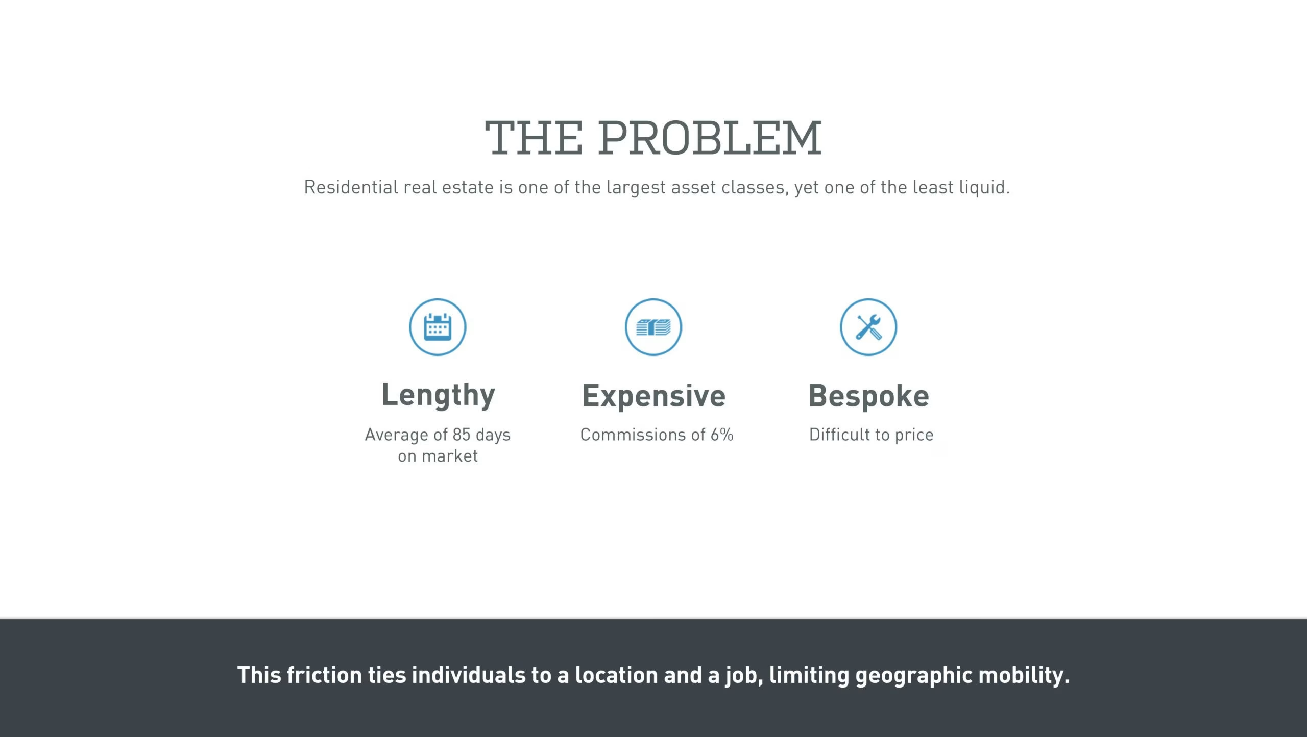
Don’t start with the problem. Start with 1-3 industry slides to tee up the context of the industry dynamics which lead to the problem. No one tells you this.
They should delete their main header and make the subheader the header. The sub should add some more clarity for investors to make the process of reading the deck easier. This is the most important thing you can do, and yes, it is hard to do well.
I can immediately tell they are doing the Sequoia outline checklist pitch deck. Cough a word and broadly explain.
I just noticed the footer. So that should be in the subheader. The takeaway approach is what some consulting firms do. I have my own views.
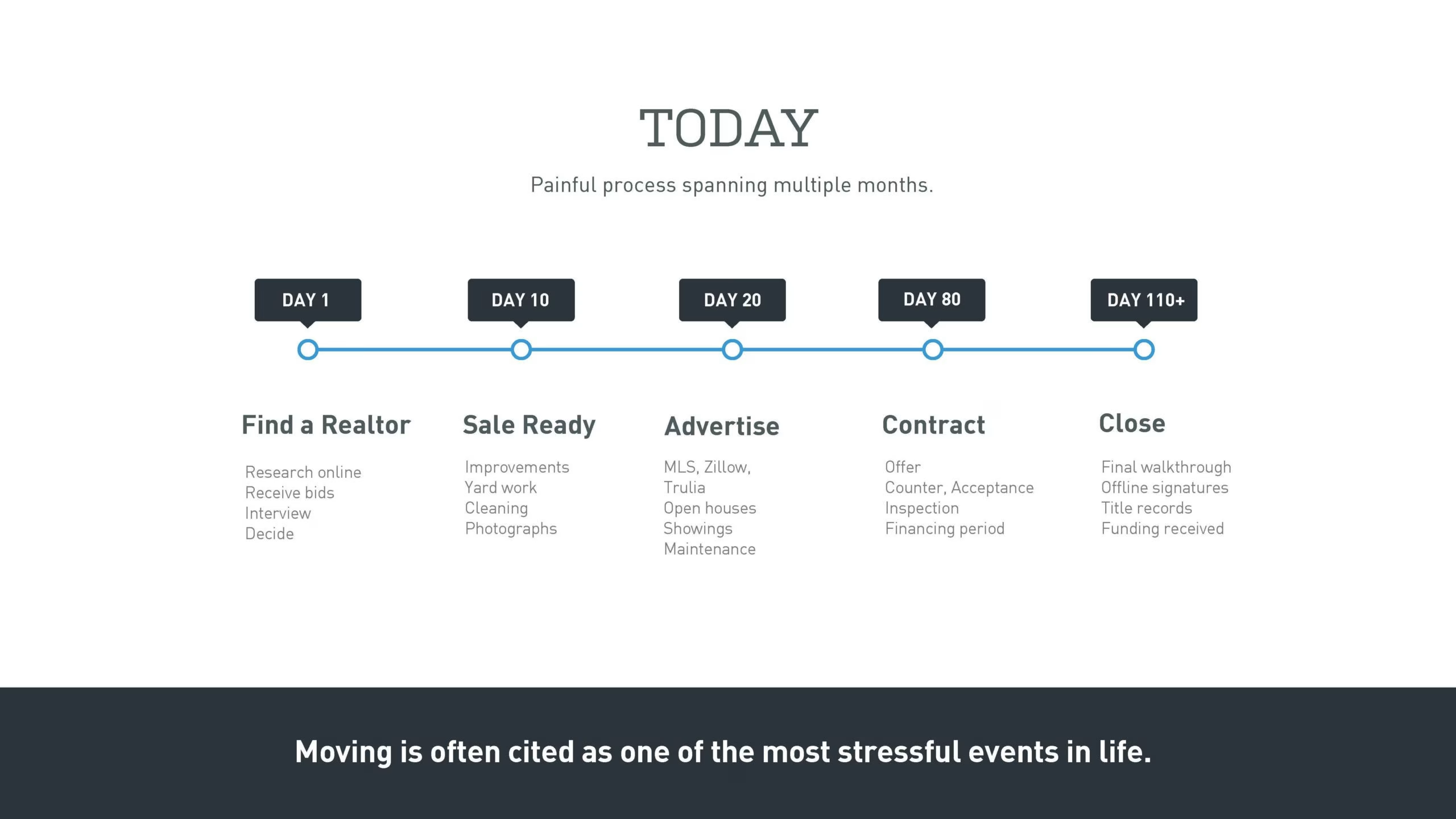
Today is the lamest title you can imagine. I feel the transition from the problem to today is jarring.
The header should be something like “buying a house is a pain in the ball sack which takes 110 days”. Well, not the right wording for a deck, but you still got the point.
The structure of the slide is solid. I would probably add an icon above each point to help illustrate things.
I don’t really get the geographic mobility narrative they are concurrently telling in the footer.

It’s really weird that they stick in the market size slide here. It just doesn’t flow. It’s a bid dick energy thing to do to communicate how you want, and I don’t like it.
The sub-body content description is a little small to be easily legible.
They make a statement in the footer about little innovation, but they do not prove it. I want every statement proven.
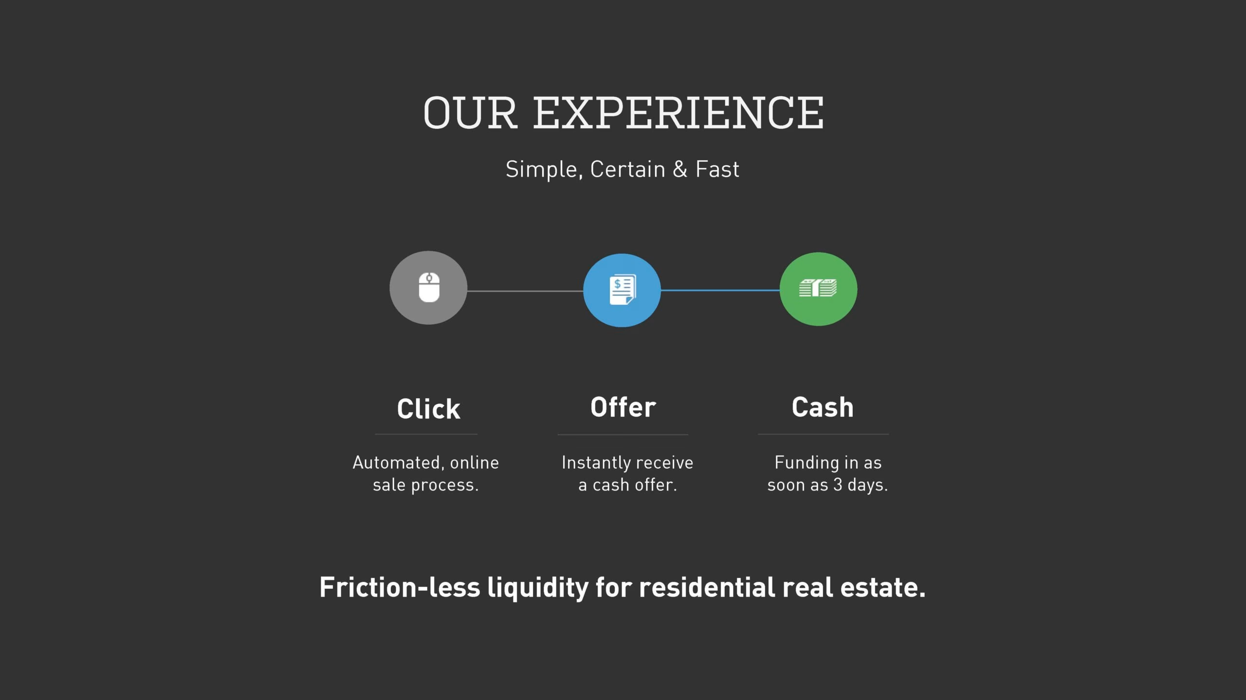
They already shot their load on the team – which should be their experience. So what is this slide about now? Oh, they mean the experience of their product. The title is terrible.
They explain the process simply. I would like to see some images rather than icons to feel they have a product.
What’s the story with the footer “header” now? It’s all about frictionless purchasing of houses, and not relocating? Do you see what I mean?

Never include interstitial slides. Your deck should not be long enough to need them.
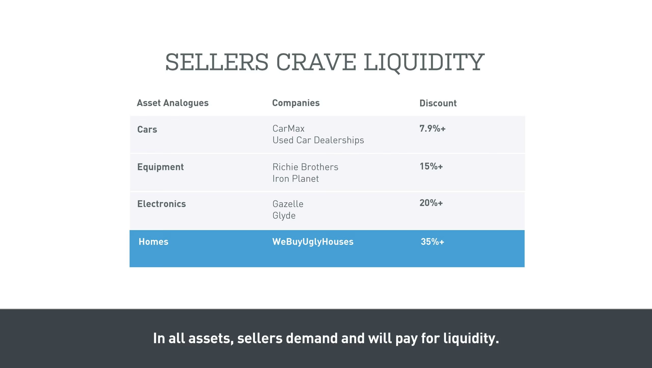
I feel jarred again. There is a hard shift into sellers. They have an analogy explanation. This might be a smart slide, but it’s hard to follow the way it is done. We are now talking about liquidity.

This is such a meaningless, lazy and confusing slide. Discount of 15% for what?
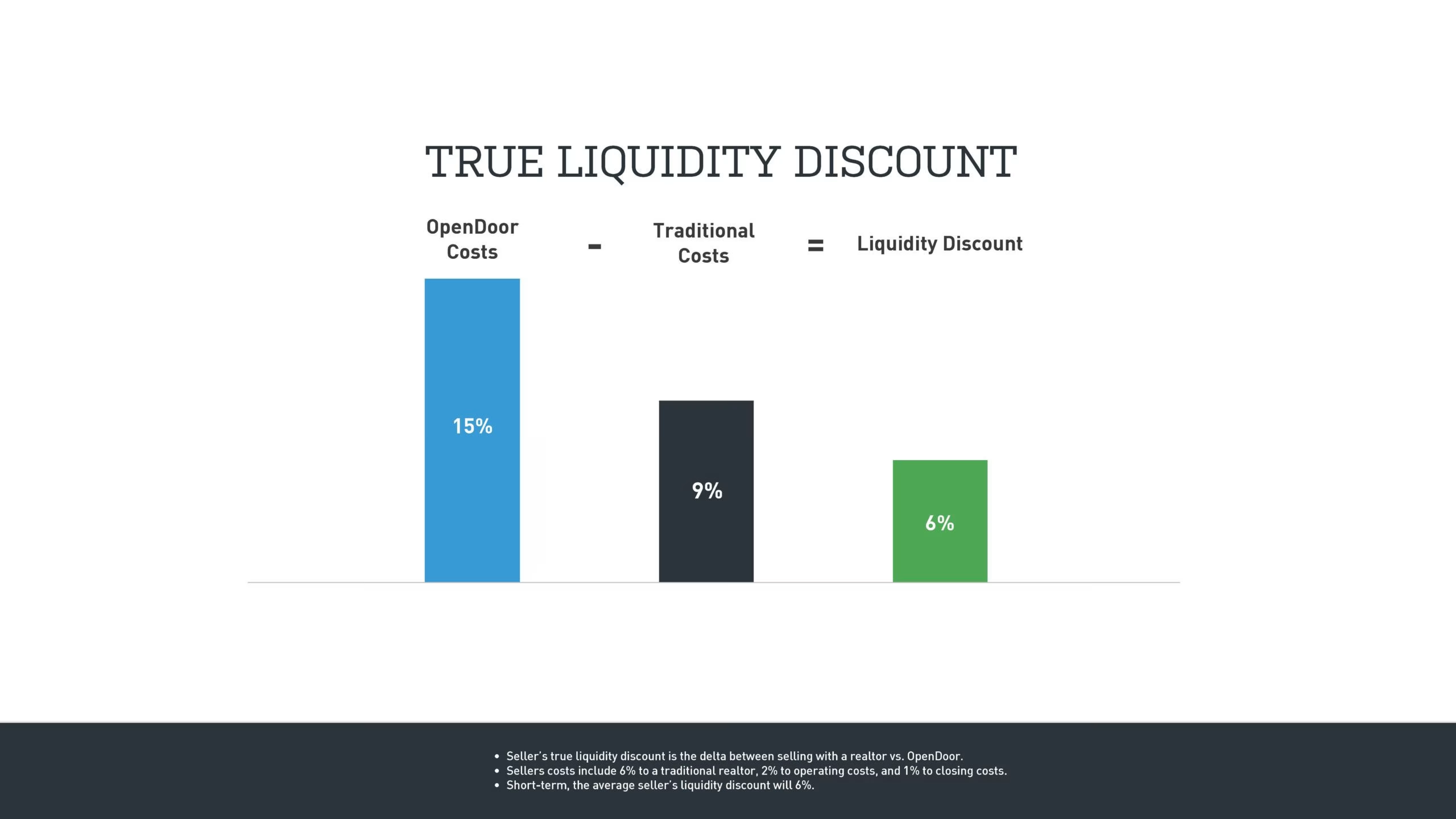
There isn’t any real explanation to follow up. So there is some liquidity discount and size 6 font in the footer I can’t read which I presume explains the points.
This deck is clearly designed to be talked to. Keith is in the company and raising from his own firm, so he can have that control over the dialogue.
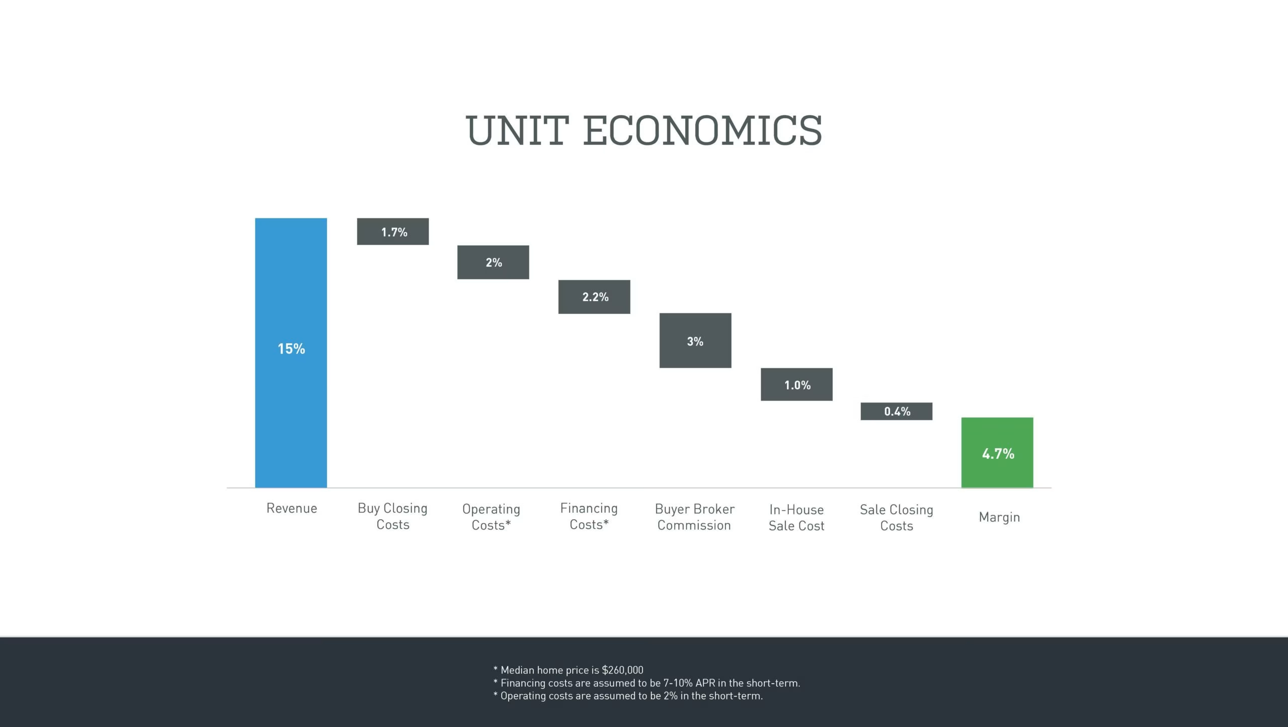
We are now in the execution section dealing with traction.
Waterfall slide. Cool. A little tricky to make in Excel if you don’t know how to.
The header is shite which is becoming a trend now.
Why is the footer text so minuscule? That’s so annoying.
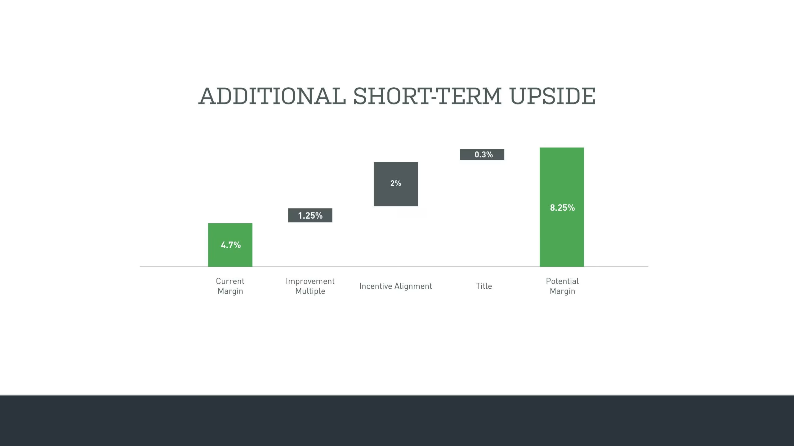
Stop. Tell me what the point of this slide is in 3 seconds. Can you? I can’t. In fact looking at it, I still can’t. Make like easy for investors.

Again with the interstitial slides. Don’t do this.
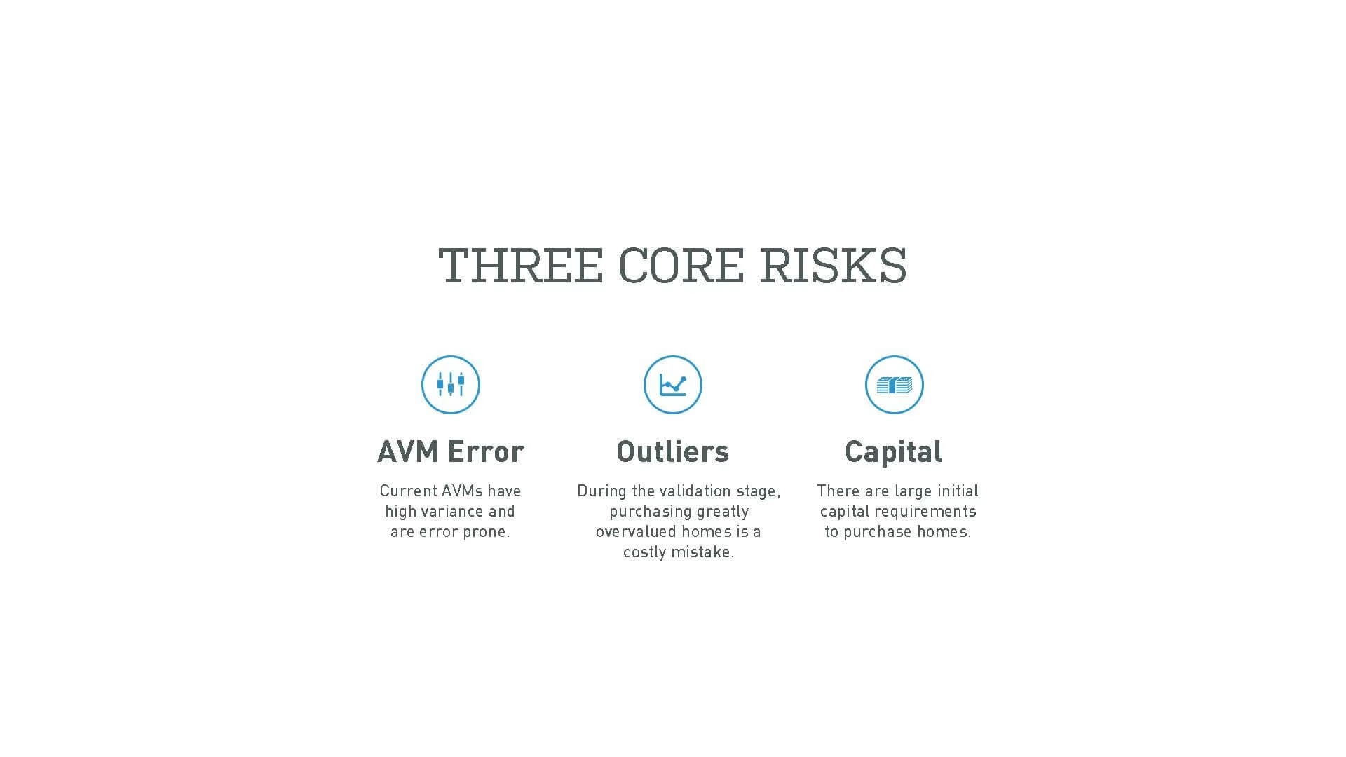
Literally, why was the last slide needed? WTF, right?
Do not use acronyms normal people don’t understand. I read a lot and have no idea what AVM means. You can also argue that investors who don’t understand acronyms shouldn’t invest, but like, who understood Snapchat?
The risks all sound like underwriting issues. I’ve noticed that stronger founders aren’t afraid of showing their warts. It’s not often, but I’ve found at least 2 startups in the public pitch decks that attempt to not hide anything.
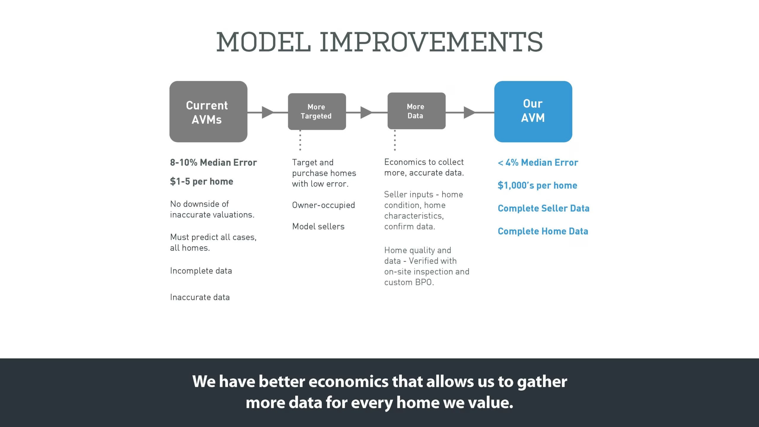
I’m guessing this slide is meant to follow from the preceding one.
The slide is a little hard to follow be honest. This feels like one of the slides made by founders who are too into their product and forget no one else knows as much as they do.
Don’t get me wrong, but there is smart content on the slide, it’s just too difficult to get the point. That is not my problem, it’s the writers.
Whenever you make a slide you need to ask yourself “Can some random person understand the slide in under 5 seconds”. If you can’t then you’ve messed up. Who cares if there is smart content, if investors don’t read it and understand it quickly, forget it.
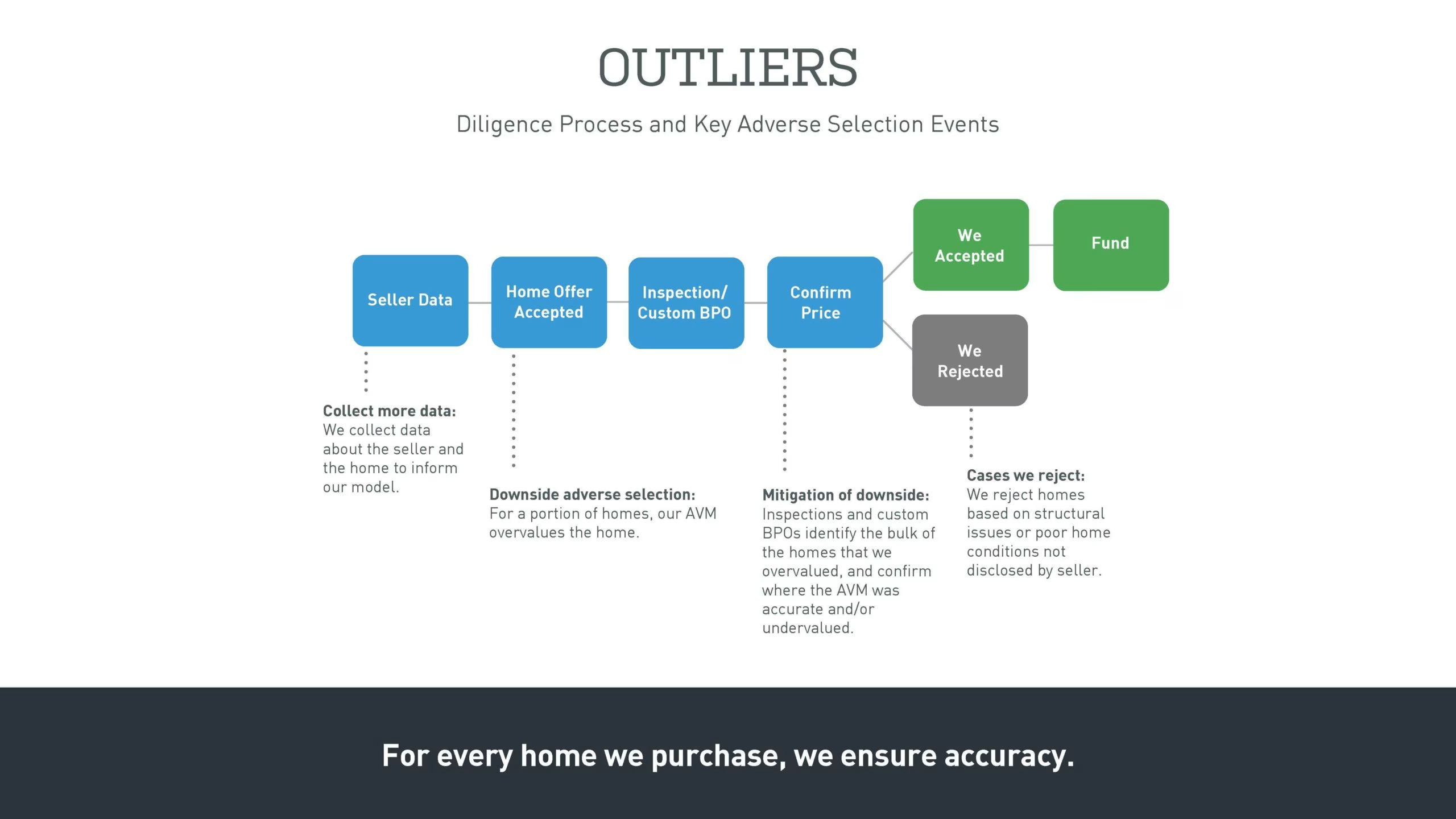
I love flowy charty slides like this but this is an effort to get through. I really hate having one-word headers like “outliers”. It really gets on my tits.
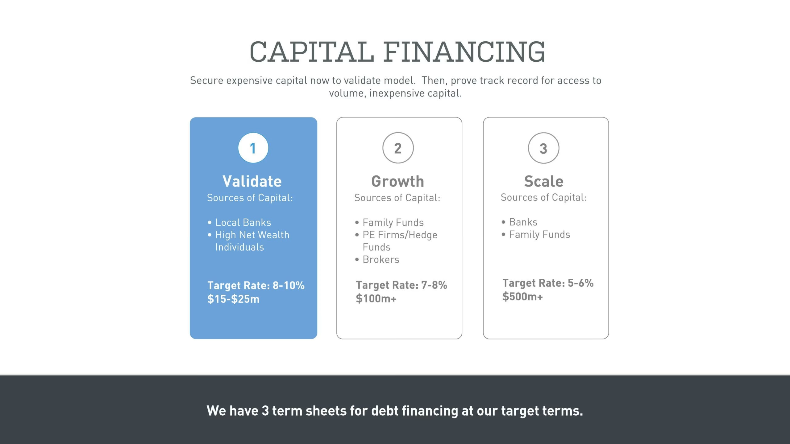
The slide has some smarts.
- They call BS that they need equity (expensive) capital from rich people then get it from, what, rich people? Ok they have banks, but not sure the capital sources make sense
- They say they have 3 term sheets, at least for debt financing, on their “target terms”
I don’t know what the target rate means. Is that the cost of capital?
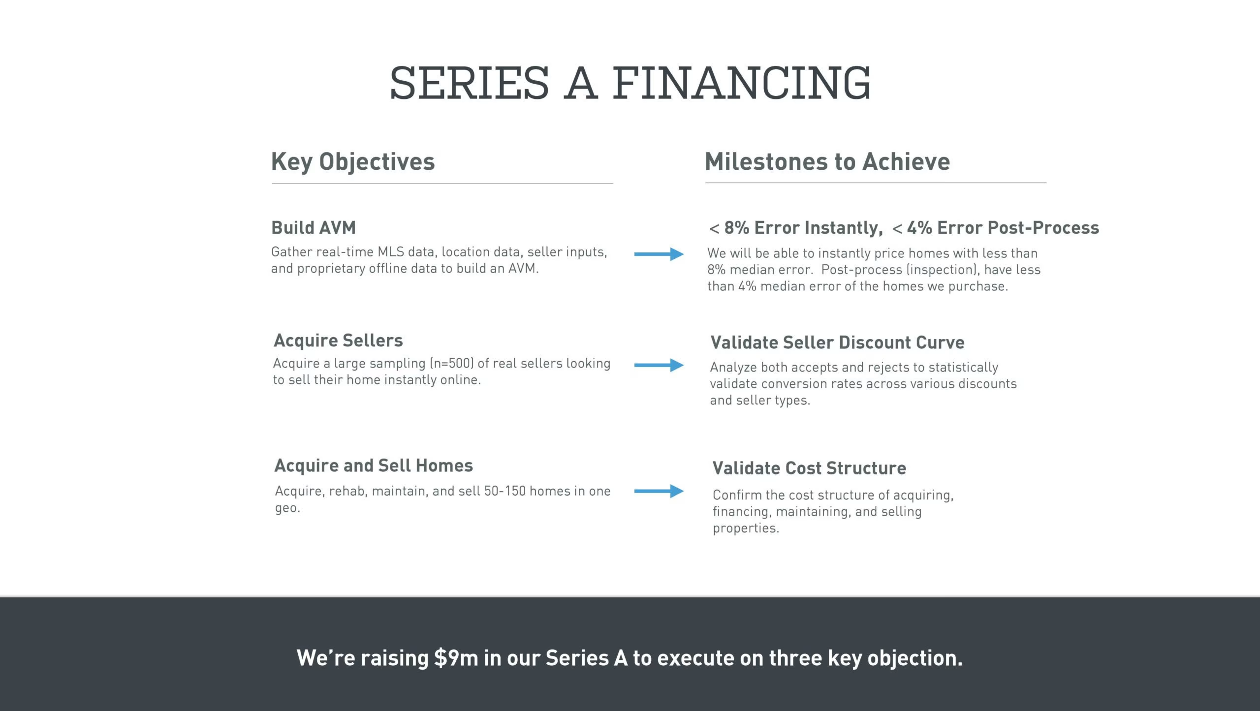
This is sort of the ask slide. It’s actually one of the best ones I’ve seen, though it feels a little academic. The words are on the top end.
I love they write they are raising $9m to achieve three objectives and similar to OKRs (You can read my blog on OKRs here).
It’s too wordy so I haven’t read the text, but I love the objective and milestones to achieve. The top milestone is great as it is quantified. The other two should have numbers.
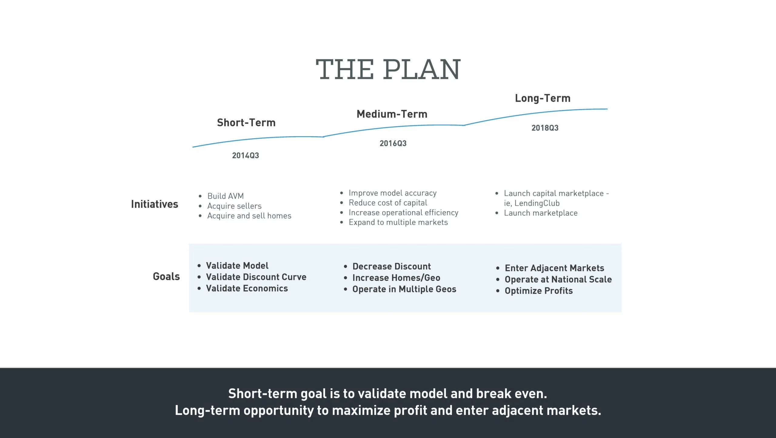
When I look at this I think “product roadmap” slide. But this is more academic and I like it.
The quarters are weirdly American and specific.

Most founders write “Thanks”, in their emails or the same lame-ass crap. This is a cool ending slide.
I’m perplexed about how we are back to this geographic mobility thing.
Having read the content, it seems shite to me. Does it resonate with you?
Deck Collection
See the rest of the collection here:





Comments (0)
There are no comments yet :(